aws
Hava CLI - Real Time Cloud Architecture Diagrams in Your CICD Pipeline
Hava's CLI is generally available. It gives you the ability to make your cloud architecture diagrams real-time by creating and updating diagrams...
In this article we are going to look at how you can easily insert fully interactive cloud infrastructure and security diagrams directly into your Wiki as well as most other web properties.
Cloud engineers leverage accurate infrastructure diagrams to speed up the comprehension of how networks hang together and to convey that information to new team members and other interested stakeholders in the organisation.
Diagrams tell a story that is easy to comprehend which would be vastly more complex and harder to understand if you had to rely on viewing console configs.
When it comes to producing cloud infrastructure diagrams most engineers and developers fall at the first hurdle. Diagrams are often considered much too time consuming to produce manually and are then often forgotten about as system changes are deployed, so never get updated.
Diagrams are easily ignored, that is until you need them. Like during an unexpected outage, security incident, or in the run up to an important compliance or governance audit
Live diagrams in your WIKI provide your team with the information they need, where they need it, when they need it.
In the following article we will cover:
Ok let's get into to it:
In most cases, the more transparent your network infrastructure is to your team, the better the comprehension. Not knowing exactly what is going on, like where the resources live, where the data resides or exactly what resources you are currently running can lead to mistakes being made.
When you know how traffic enters and exits your cloud, what ports and protocols permit or block access and what other resources your compute instances have access to, you and your team can manage, maintain and improve your cloud infrastructure like the seasoned pros you are.
Then of course when things go horribly wrong, like your cloud provider has an availability zone outage, knowing what should be running vs what is there now can assist in a much faster resolution.
The power play in terms of making this data available to your team is to place it where they hang out, where they go to look for network doco. Nine times out of ten that's a Wiki or intranet.
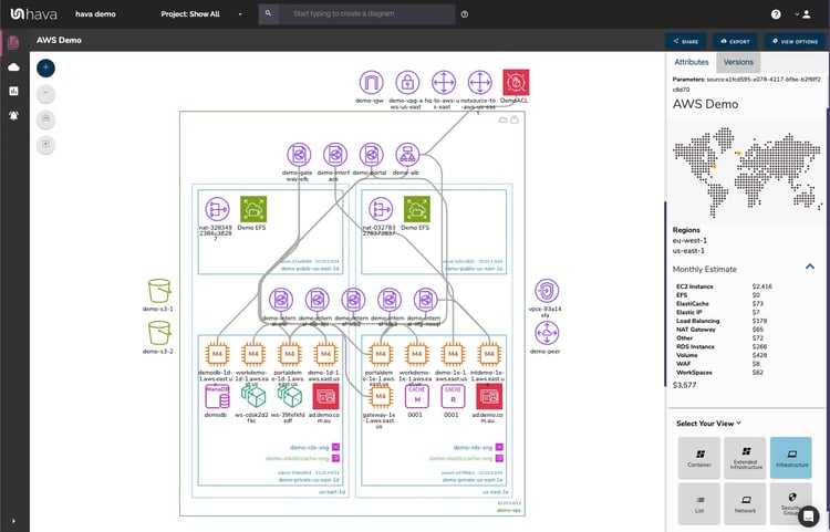
So making live interactive diagrams available right inside your Wiki like the ones auto generated by Hava means your team has access, even if they do not have access to a Hava account.
It's not just your engineers or developers that might find this incredibly useful, other stakeholders like external consultants, network architects and management can also view exactly what you have built. If you were providing MSP or Professional Services managing client cloud accounts, you could place diagrams in their internal systems to provide the ultimate transparency.
Any way you look at it, embedding live interactive cloud infrastructure diagrams into Wikis, Intranets, support desks or specific web applications like Confluence can improve communication, assist speed to resolution and improve team morale by keeping everyone on the same page.
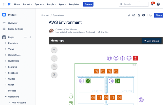
Love it or hate it, Atlassian Confluence is the Wiki of choice for hundreds of thousands of dev teams. You might be one of them.
We use Confluence to store and organise documentation, SOPs and a whole host of information about our test, dev and production environments. So what better place to drop diagrams related to our running environments than directly in confluence.
To make the embed process as smooth as possible our developers created a confluence plugin to make the process extremely simple.
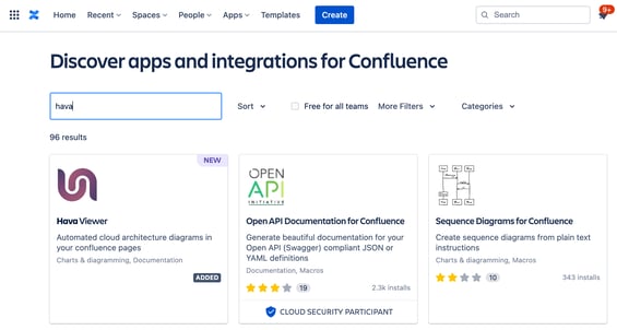
The Hava confluence integration can be found on the confluence marketplace and there is no additional cost to use it.
If you aren't using Confluence or have a different web property in which you would like to place your interactive cloud infrastructure diagrams you can use the embedded viewer built in to Hava.
This functionality allows you to generate iFrame code directly in the diagram you are viewing using the diagram share dialogue.
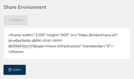
All you then need to do is paste the code snippet into the target web property. That could be an intranet, a Notion page, a Jira ticket, a web application or anywhere that supports iFrames.
The viewer embeds the interactive diagram on the target page, so anyone permitted to view the page can inspect the diagram, navigate around the resources, view the resource metadata without having to access your cloud consoles or log into Hava.
Just as auto generating diagrams that keep themselves up to date saves time and removes the reliance on humans to keep things up to date, we've used the same approach with embeds.
When you embed a diagram, you aren't embedding a copy of the diagram, you are inserting a diagram endpoint URL that is dynamic.
As Hava detects changes and updates diagrams, the diagram at the diagram endpoint also updates.
This means you only have to insert a diagram once and the diagram available at the target web property is kept permanently up to date. No need to delete and re-insert the latest copy of your infrastructure diagram, it is all taken care of.
Giving line of sight to potentially sensitive network information does throw up some questions though like:
Detailed infrastructure diagrams can carry quite sensitive data, which might not be appropriate to share on a company wide or publicly facing web property.
Sometimes you might want to share the gist of how your network is constructed, but not the sensitive details like IP addresses.
To solve that problem, Hava lets you choose the view that you want to embed.
You can share the full interactive diagram with everything visible, a light version of the same interactive diagram that shows all the resources with the metadata suppressed or you can embed a simple PNG snapshot of your diagram without any of the interactivity.
In all three cases, the diagram endpoint is dynamic, so even if you have embedded a static PNG image, if the infrastructure changes, so does the PNG
Hava is the go-to solution for automating your cloud diagrams if you are building on AWS, Azure, GCP or stand alone Kubernetes.
As well as fully automating your cloud documentation and keeping your diagrams up to date (hands-free), Hava's integrations like the Confluence plugin discussed here or the GitHub and Terraform integrations lets you generate and display cloud infrastructure diagrams wherever you need them.
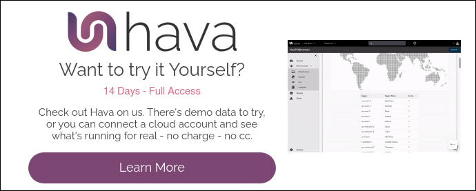
When you sign up for a Hava account for the first time, you will get a free 14day trial of the Teams account tier. This has all the Hava features enabled so you can evaluate the benefits for your organisation.
At the end of the 14 day trial, you can opt for a paid plan and connect more cloud accounts.
You can get started today and have beautiful detailed cloud infrastructure diagrams in your hands in just a few minutes.
Click this button to learn more:
Hava's CLI is generally available. It gives you the ability to make your cloud architecture diagrams real-time by creating and updating diagrams...
Hava automated cloud diagrams now include AWS EKS clusters. See how to connect and automatically generate your EKS container diagrams with Hava.
Hava automates AWS EKS cluster diagrams. See how to connect and automatically generate your self updating EKS container diagrams with Hava.