aws
Cloudcraft Alternative Hava.io
If you are looking for a viable Cloudcraft alternative, drag and drop free, that generates AWS, GCP, Azure and hybrid diagrams, with security...
In this post you are going to learn exactly how you can examine what you have running in your cloud accounts without having to spend hours or days trawling through your cloud consoles trying to establish how exactly does this thing hang together.
It's important to know what is going on in your cloud accounts, especially if you have multiple engineers or entire dev teams making changes. When you can see your infrastructure with some clarity it becomes easier to communicate with other stakeholders. Onboarding new engineers suddenly becomes a joy and you can respond to governance and audit requests with confidence.
Most organisations, even Fortune 500 companies with huge staffing levels and massive budgets fall down when it comes to cloud network documentation. Producing it is often an afterthought and forget keeping it up to date, everyone is way too busy for that.
Most teams deploying cloud solutions fail to accurately document and update their environments!
In this article we'll look at:
Diagrams can be tough and time consuming, especially if you are working with complex cloud environments or multi cloud solutions.
The thought of opening up multiple cloud consoles and trawling through hundreds of pages digging out resources, seeing how they are configured and trying to make sense of how everything fits together fills most people with a sense of dread, stepping out into moving traffic level dread. Well maybe not that bad, but you get the point, it's one of the least favourite tasks of developers and engineers.
So ultimately people will find any excuse to not document deployed infrastructure and of course find way better things to do instead of updating diagrams when changes are made.
While some might consider diagrams an afterthought or nice to have but not essential there are very real and what we would consider substantial benefits to keeping your cloud infra diagrams up to date. Benefits that can save you massive amounts of time and money and bring more efficiency to your engineering workflow.
When you automate the process with Hava these include:
When everything is running smoothly, having up to date diagrams may not seem like a priority, but that can change in an instant and having infra doco on hand can save you hours or days identifying the root cause of your application outage.
We've already discussed how people will find any excuse to not keep network documentation up to date. It's a bit like cleaning out the gutters, it's a job that nobody enjoys, it's easy to ignore and you can get by just fine without thinking about it. That is until the next storm hits and you have water flooding into your bedroom ceilings.
The ultimate solution to ensure your network diagrams get created and are kept up to date is to take the humans out of the equation. By automating the diagram creation process with Hava, you can ensure you always have accurate diagrams for every VPC or virtual network you have configured in your AWS, Azure and GCP accounts.
When it comes to updates, fully automated is also the way to go. If you rely on manually invoking diagram updates, that's probably not going to happen. The flaw in relying on manual updates is that lots of things could have changed since you last updated. The new diagram will reflect what is running now and you may have no clues as to what change was recently made that is causing your current outage or performance issue.
Hava's approach is to continuously poll your cloud config and when changes are made, a new diagram set is generated when changes are detected, even if you haven't logged in for days or weeks. An audit trail of changes are captured in versioning, so you can compare older diagrams to review the changes.
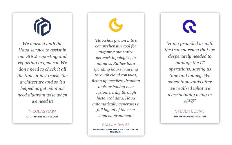
When you are managing networks for clients, the ability to provide transparency helps your client understand the value you are bringing to the table.
By providing the client with diagrams of the infrastructure you have built for them, they can appreciate your work and validate that you are delivering on their brief.
But we are back to the original problem. Who has the time to produce reports, update diagrams and send them out to their client base every month. If you are an MSP for instance, producing updated diagrams and getting them out to hundreds of clients could take more time than you have.
While it is easy to export diagrams to JPG, PDF and even VSDX formats, the time it would take would leave you very little time for anything else, which could be the reason communication of client infrastructure to enhance transparency and your value is often ignored.
Hava solves the problem by allowing embeddable interactive diagrams to be placed in external web properties like client Wiki's or intranets via iframe code snippets or integration plugins.
This means that your client can view a live interactive diagram of their infrastructure without needing to access Hava and potentially viewing networks belonging to other clients.
With clear communication and transparency, your clients are never left wondering what you do for them and are more likely to stick around.
Clear communication goes a long way to fostering team morale and inclusion. When everyone knows what is going on, life is that little bit easier for everyone.
When your network architect can see that the Dev team has followed the plan and the Security and Ops teams have clarity on exactly what needs to be running and secured to keep your production resources in an optimal state, everyone is on the same page and a whole lot happier.
While this is the least tangible benefit in this article, don't underestimate the importance of keeping your team members in the loop. Infrastructure diagrams let everyone know what is running where. Having access to these diagrams means your team at all levels are "in the loop". You don't run the risk of engineers "not getting the memo" about a new resource being deployed that might cause them confusion or when you take on a new client, they are not left in the dark and they can see exactly what they are working with.
The happier, more included and informed your team are, the likelier they are to stick around and the more engaged they will be with your work.
Staff churn, especially in the tech space is incredibly expensive so anything you can do to keep your people contented is recommended, even if it's something as innocuous as providing up to date interactive network diagrams.
Making cloud diagrams available to your team and clients without spending a minute drawing or trawling consoles is easy if you connect your cloud accounts to hava.io
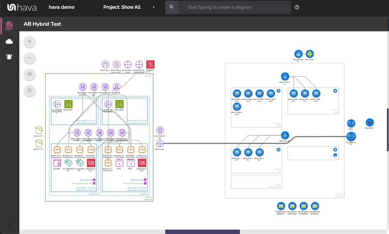
Using read only or cross account role credentials, once you connect to Hava your job is done. The rest is fully automated and hands-free. Every VPC in your cloud account gets its own diagram set, whether you have 1, 100 or a thousand.
You get:
Diagram updates are handled automatically. No manual intervention is required.
Superseded diagrams are placed in version history so are available for comparison and audit purposes.
Diagrams can be embedded externally
Diagrams can be exported to JPG, PDF, CSV, JSON and also VSDX for editing
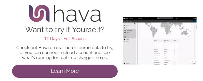
You can view a walkthrough video on our website home page, or use the button below to take a free 14 day trial.
If you would like a 1:1 screen share demo, chat about your use case or to discuss how you can self-host Hava on your own infrastructure, use the chat widget on the bottom right of the home page to chat with a real person.
Thanks for your interest,
Team Hava
If you are looking for a viable Cloudcraft alternative, drag and drop free, that generates AWS, GCP, Azure and hybrid diagrams, with security...
Hava automated cloud diagrams now provides complex operators and deep search to help you find and document your cloud environments your way.
Having accurate cloud diagrams allows you to understand and better communicate how your network is constructed. There are so many reasons to diagram...