aws
Cloud architecture expectations v.s. reality
Active cloud architecture resources rarely end up being exactly as they were designed. How do you know exactly what resources are running now? What...
Cloud Infrastructure Visualization is the best way to get all your team on the same page when it comes to what cloud computing resources you have running.
The problem is to get a diagram together that shows your current running resources across potentially hundreds of VPCs or different cloud accounts or even a single VPC can be a tedious time-suck especially of you have to draw the cloud diagrams yourself.
Back in the dark ages (pre 2018) you had very little option but to draw cloud architecture diagrams yourself.
You would need to bust out a whiteboard and marker pens or a drawing package like Visio, download or design an icon pack that covered all the services you had deployed in your cloud account and get to work analysing your cloud console, finding all the deployed resources and then try to map them out logically.
With a large environment, this process could take weeks.
If you took on a new client with existing running infrastructure, this could take even more time just to get to grips with what was going on.
You almost never walk into a new role or a new client and have up to date, detailed infrastructure diagrams on hand so you can get up to speed and understand what you are working with at-a-glance.
We know, we've been there. Once upon a time our core team were cloud IT consultants providing services to companies wanting to improve their IT infrastructure.
The very first job was to establish a starting point.
"Where are the current infrastructure diagrams?" question was almost always met with a blank stare. More often than not the original architect had moved on and any diagrams still kicking around were way out of date and useless.
So we would grab a whiteboard, open up the cloud consoles and get to work.
But we knew there had to be a better way.
There was.
So back to the consulting days. We would get hold of a new client's cloud account, dig into the console and start identifying what's running.
Because the major cloud vendors provide API access the first shortcut to eliminating days or sometimes weeks of manual analysis was to automate the extraction of the running services and resource instances.
The next logical step was to find out a bit more about each resource, so we captured the metadata and settings for each resource.
Finally the tricky part. Mapping out the resources and associations to create a visualization of each virtual network or VPC.
Hava was born.
What that means for you is you can now simply plug in an AWS, GCP or Azure cloud account and Hava does all the work for you. The app scans your cloud configuration, works out what is running, where it is running and maps it out logically on an interactive diagram which shows:
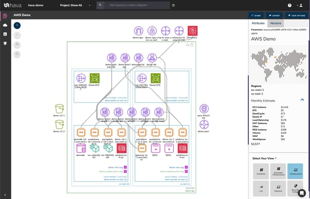
The beauty of the diagrams automatically generated by Hava (apart from not having to spend days drawing them yourself) is that they are interactive.
By clicking on a resource instance, let say an AWS EC2 instance, Hava's cloud infrastructure mapping will show you what it is connected to. The attribute pane to the right of the diagram changes to display all the known settings and metadata related to the selected resource.
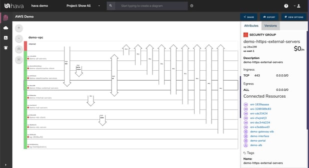
When you connect an AWS or Azure account to Hava, a set of diagrams is automatically generated for every VPC discovered. One of these diagrams is the cloud infrastructure security visualization.
This diagram lays out all of your security groups. Overlaid on the diagram are arrows indicating the open ports, the protocols involved and where the traffic ingress and egress points are.
Selecting a security group shows you exactly what resources are connected.
This diagram typically flags up configuration issues that security professionals can spot within seconds. A far cry from digging into the deepest depths of your cloud console configuration settings.
When you connect your cloud accounts to Hava, the application starts to monitor your cloud configuration. Any changes that are detected trigger generation of new diagrams, with the previous version being placed into version history.
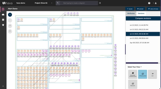
From a cloud observability point of view, you would expect that capability from your cloud management platform.
This allows you to time travel. You can go back to any point in time (subject to your data retention settings) and pull up a fully interactive diagram showing how your cloud infrastructure was configured. Cool hey. Especially when you have auditors asking awkward questions.
However we don't have a habit of only doing what is expected, we like to take things to another level.
Architectural monitoring alerts add another layer of depth to your cloud inventory visualization.
When you configure Hava alerts, when changes are detected that instantiate new diagram creation, you are alerted via email. The alert isn't just a bland "hey something just changed" message because we are all about visualization.
You get a detailed diff diagram showing you what changed in your cloud topology, what was added and what was taken away. This is essential Infrastructure management intelligence and something anyone managing cloud infrastructure should have high on their priority list.
If we consider cloud security for a second. The alerts feature allows you to include multiple recipients, which should definitely include your security team. This means whenever anything is deployed, whether they were in the loop or not, your security team gets to know about it.
When you have multiple cloud vendor accounts, or a ton of client accounts under management you can keep an eye on what changes your team are making and more importantly what changes your clients are making of their own volition.
If you are running containerized workloads on Amazon ECS or EKS, Google GKE, Azure AKS or even stand alone Kubernetes clusters Hava will detect the clusters and produce a diagram displaying the status of the services, pods or tasks within each cluster.
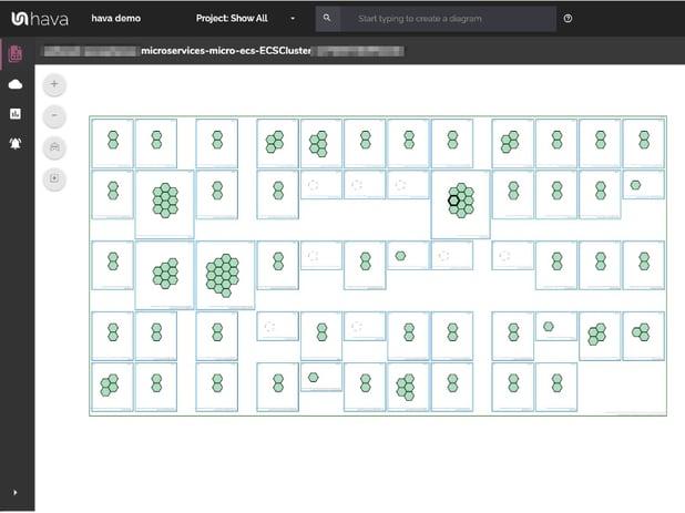
The tasks represented by the hexagons are colour coded, which means you can tell at a glance if there are any stopped or stopping services that should be running.
The process is pretty simple and you can get started for free.
You can take a free 14 day trial of the Hava teams plan, connect your cloud account and you'll have detailed infrastructure and security diagrams in your hands within a minute or two.
Of course we would love you to enjoy all the advanced features available on the paid plans so you can keep all your cloud documentation available and up to date, track versioning, get alerts and generally have a much happier life.
You can learn more here:
Active cloud architecture resources rarely end up being exactly as they were designed. How do you know exactly what resources are running now? What...
Are you running dev or test cloud environments that are no longer in use? Do you have resources running that nobody is using. Connect Hava to your...
Using Hava's custom search, you can identify and diagram resources from multiple vendors and cloud accounts with a single command. Wildcard and...