aws
How to find your cloud services fast in the middle of an outage
Identifying cloud services and resources in the middle of an outage is critical. The faster you can do this the better. See how Hava can help.

In the expansive realm of cloud computing, AWS still dominates, providing a vast array of cloud services to organizations of all types and sizes. In this rapidly evolving field, visualizing and comprehending the complex web of cloud architecture can be challenging. However, the premier AWS diagram generator is here to assist you in navigating the intricate nuances of cloud infrastructure.
Today we will unveil the exceptional power of Hava, which in our opinion is the best AWS diagram generator on the market today.
Bring your cloud infrastructure into focus with Hava.
Hava is excels at harmonizing and clarifying the convoluted landscape of your cloud architecture. This unrivaled visualization tool possesses the following characteristics:
FAQs:
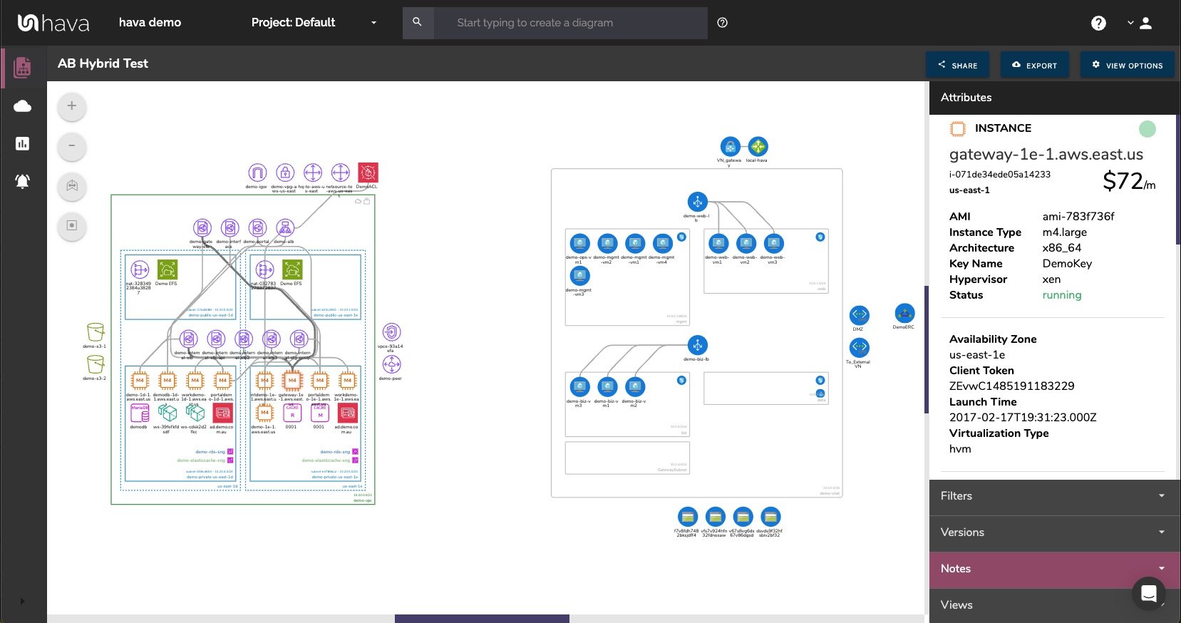
The Infrastructure view is a fully interactive diagram that show you your VPCs or Virtual Networks. Inside the VPC you have availability zones and subnets that show you what resources you have running and where they live.
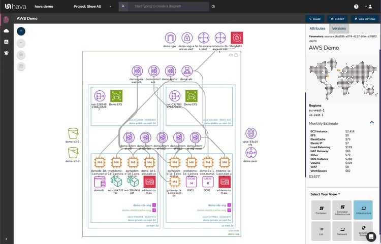
The interactive nature of the Hava diagrams eludes to the ability to select individual diagram components which changes the attribute sidebar to display all the known metadata related to that resource. This means you don't have to keep flipping backwards and forwards through your cloud consoles to find out the information you need about a highlighted resource.
Another view is the Security View. This is entirely unique to Hava and shows you the security configuration for your AWS or Azure VPCs
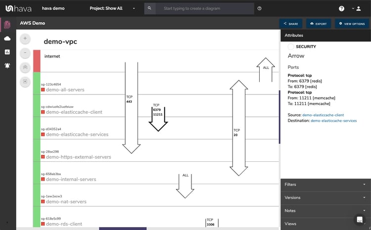
This view is also interactive and shows security groups horizontally with the open ports and protocols that allow traffic ingress/egress shown as arrows overlaid on the groups.
Selecting a security group on the diagram changes the attribute panel to show a ton of useful information including all the connected resource that security group controls.
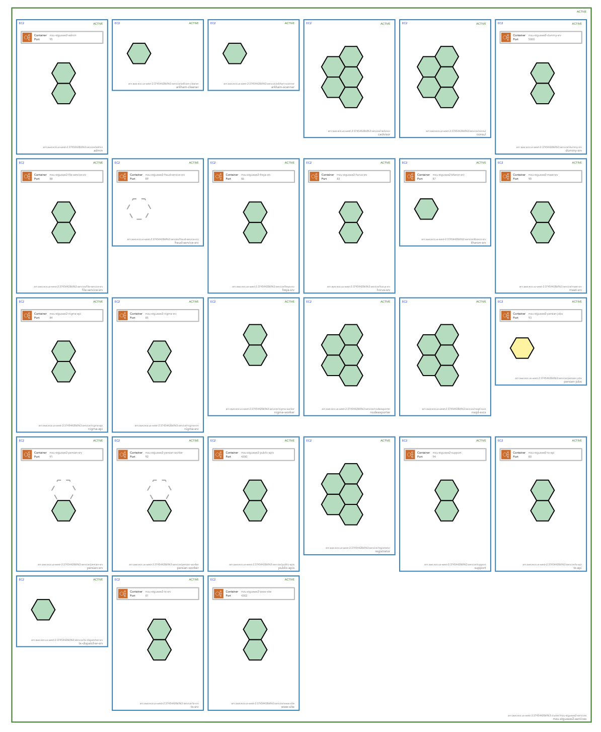
If you are deploying containerised workloads on ECS EKS AKS GKE or stand alone Kubernetes clusters, you can leverage Hava's Container View to see the status of your pods or tasks in each cluster. While not as detailed as say the infrastructure view in AWS, you still get to see all your tasks and whether the run status is optimal or not.
Yes.
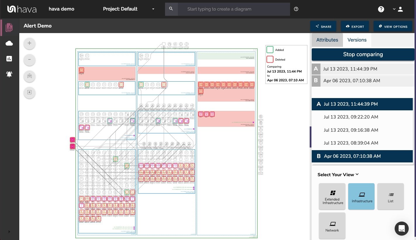
When you set up architectural monitoring alerts within Hava you will get notified when something changes. The same process that continuously monitors your AWS config to update your diagrams will also email you and anyone else you nominate with notification of the detected changes. The cool thing is, the email contains a diff diagram showing you what was added to your cloud environment AND what was removed. That's pretty powerful.
Throughout this exploration of the what we firmly believe is the best AWS diagram generator available today, we've unveiled its extraordinary ability to simplify the visualization of complex cloud infrastructure.
We think this exceptional tool is essential for businesses seeking to understand and optimize their AWS environments.
From the remarkable insights it offers to the extensive customization possibilities it provides, Hava is truly the gold standard in its field. Designed for organizations of all sizes, it encourages collaboration and fosters effective communication among team members.
In the era of cloud computing, the premier AWS diagram generator is an indispensable resource for businesses aiming to navigate the multifaceted landscape of AWS services.
Hava continuously scans your AWS architecture and when changes are detected a new diagram set is automatically generated. The superseded diagrams are not discarded or overwritten. Instead they are moved into version history. Still fully interactive.
What this means is you can view your cloud architecture at any point in time and also leverage Hava's revision comparison (Diff Diagrams) to quickly identify what has been added or removed between the two diagram dates.
So you can easily identify all the changes made since your last compliance audit, or see what changed yesterday that is causing unexpected network or application errors.
While diff diagrams are super helpful in diagnosing changes after the fact, you may want to keep on top of changes as they happen.
Hava's architecture monitoring alerts will let you know the minute a change is detected. You simply nominate the environment you wish to monitor and add a group of recipients to receive the alerts. When a change is detected like the addition or removal of a resource, Hava will send each recipient a diff diagram showing the changes.
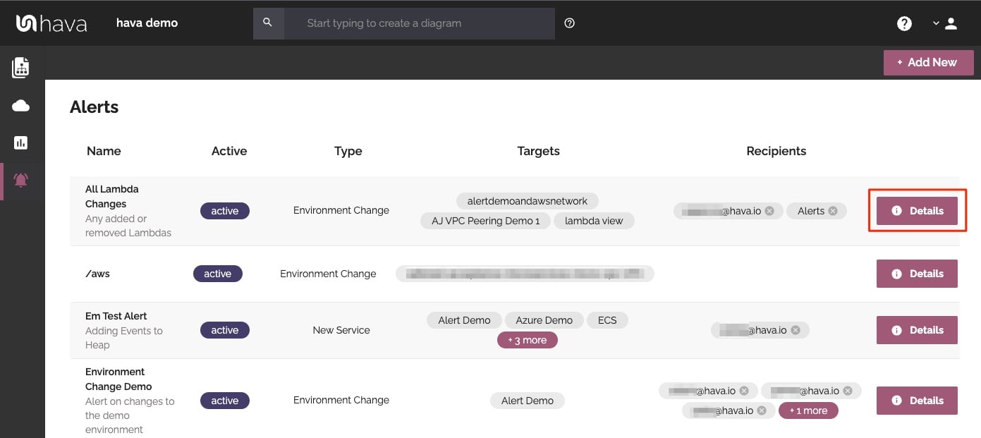
Now you and your security team can be across every change as it happens so you can assess and take action if required.
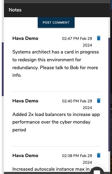
For every architecture diagram generated you have the ability to add text comments. This serves as a rolling dialogue your team can contribute to that may better explain elements of the diagram or bigger picture concepts related to the diagram.
Notes are accessed from the accordion menu within the attribute pane.
New notes are added to the top of the list so they are stored in chronological order.
Finally, your documentation is only useful if it is accurate. It is quite possible to spend weeks manually constructing network topology documentation only to have it rendered useless by a minor change to your network configuration.
In the middle of an outage or network incident that has taken down your application, being able to quickly establish what should be running is crucial.
Built into Hava is an auto-sync function that polls connected data sources and automatically updates diagram sets when changes are detected. This means your diagrams are always current and up to date. The superseded diagram sets aren't discarded however. They are placed into a version history that enables you to pull up older diagrams in the same fully interactive format.
This allows you to quickly and visually identify changes to your cloud network topology, so you can easily compare a previously working set of network resources with the current configuration to see what's missing .
It also allows you to demonstrate the status of your network at any point in history. This can be invaluable during a pci compliance audit or insurance claim should your network design ever be called into question.
Native AWS architecture diagrams created by Hava are the nearest we've seen to the examples and recommendations provided by AWS. These are great to view and interrogate via the interactive dashboard, however sometimes you'll need to pull a set of diagrams for audit purposes or for management or sales presentations.
Hava's built-in export function allows you to do this in a number of formats.
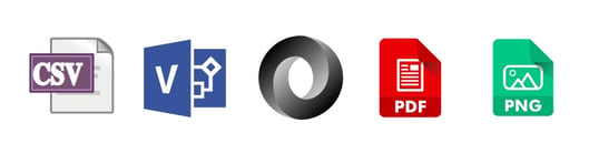
CSV, VSDX, JSON, PDF and PNG
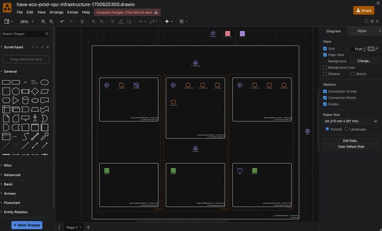
Should you want to manipulate or embellish your Hava generated diagrams, exporting to VSDX format and using Visio, draw.io or any VSDX compatible drawing package will allow you to edit your diagrams as required.
Should you not have access to Visio but would like to try this out, try opening one of your exported VSDX files in draw.io
Getting Hava to do the bulk of the heavy lifting by initially generating accurate diagrams based on what is actually configured and running in your AWS environment enables you to access a base diagram ready to edit which will save you hours or possibly days preparing management reports or upgrade plans.
There aren't too many engineers that would dispute the benefits of perpetually accurate network topology documentation. Hava provides just this with:
You can find out more about Hava here:
Identifying cloud services and resources in the middle of an outage is critical. The faster you can do this the better. See how Hava can help.
Are you running dev or test cloud environments that are no longer in use? Do you have resources running that nobody is using. Connect Hava to your...
There are so many reasons why you should automate your cloud network diagrams. These 5 are right up there, especially if you are building...