aws
How to fast-track cloud network architecture redesign
When you take on a cloud infrastructure redesign project, the first job to be done is establishing what is running where and to get that documented....
A large part of managing cloud infrastructure is making sure everything is running as expected so that your applications operate and access data efficiently while avoiding over specified resources that cost more than is necessary.
With the sometimes complex nature of cloud network topology it is understandable that you can often not notice something is wrong with your environment until you start white boarding it, even though the data that reveals the anomaly or potential catastrophic weakness has been in front of your face the whole time.
While you can scan through your cloud consoles and individually inspect resources and services that are running, your perception of exactly what is going on can be influenced by your expectations of what should be running, your historical knowledge of what was previously running mixed in with the actual information you see in the console.
Psychologists distinguish between two types of processes that can influence your perception of any scenario, these being top down and bottom up cognitive processing.
In 1970 psychologist Richard Gregory argued that perception is a constructive process that occurs in a top-down sequence. Visual stimulus in any scenario can frequently be ambiguous, so our mind fills in the blanks using stored knowledge or past experiences to make inferences about what we perceive. Gregory suggested that perception is a hypothesis which is instinctively created using a combination of prior knowledge, stored information and the current environment being observed.
Lots of information is visually captured as we observe things, but the majority is discarded by the time it reaches the brain. Gregory suggests as much as 90% of observed information is lost and that the brain fills in the gaps, effectively constructing a perception of reality, which is why it is sometimes possible to unconsciously infer the presence of things that may not in fact exist at this moment in time.
Counter to this argument rival psychologist James Gibson (1972) argues that perception is a bottom-up process where sensory information including visual is analysed in one direction from the raw data being observed and no retained knowledge or experience is involved in forming a picture of what is being observed. The more data points that were observed, the less need there was for other sources of information.
Ideally both top-down and bottom-up processes used in conjunction will result in the best interpretation of what is actually going on.
There are typically two approaches to analysing complex cloud environments.
1 - Charts and Spreadsheets.
We collect vast amounts of data from configuration files and logs and assemble the data into spreadsheets or databases and then write formulae or algorithms to navigate the data.
Anomaly detection is based on theorising what could potentially be a problem based on numbers out of range or state. This approach is great for vast amounts of data but is heavily biased towards the hypothesis or relies on mass outliers to be predictive.
You could for instance parse the data through an algorithm that says "if the RDS instance is off, then that is a problem". This rules based alert approach is valid but will not pick up anomalies that you weren't expecting or had not written into the algo.
2 - Top down visual analysis
In line with Gregory's theory, when visualisation is brought into play anomaly detection becomes based on recognising connections and resources that look out of place or don't match your existing perception of what should exist.
Our brains are able to compute thousands of data points, pieces of information and relationships based on a single glance at a diagram or two diagrams placed side by side for comparison. The information contained in a network topology diagram is understood in a split second in direct contrast to data held in spreadsheets and database tables.
In the scenario where your diagram shows that an RDS instance is now off and it shouldn't be, this is in direct conflict with what you perceived as reality and will stand out as a problem.
Comparing a known historical diagram depicting the desired state of your cloud infrastructure vs a diagram depicting the current state will remove any perception issues and provide immediate visual recognition of anomalous or even missing resources which can be critical during an outage.
Visual analysis of reality will often surface issues of resources or services you thought were configured and running but aren't or conversely it will highlight resources that are currently running but shouldn't be, like entire development or test environments.
Whether you are extracting metadata for tables or to use it to construct visualisations, you need a rules based engine that gathers and extracts the vast amount of data related to your cloud resources and related settings. (Bottom-up analysis)
This data is far better utilised if it is presented visually as you get the ability to instantly recognise resources and understand the construction of your network topology to either re-enforce or dispel your preconceived expectations.
Ultimately, when you automatically generate diagrams from your cloud account console settings and retain previous versions of the diagrams as network changes are discovered and diagrams are superseded, you have an infinitely faster and cognitively compatible method of spotting anomalies. (Top-down analysis)
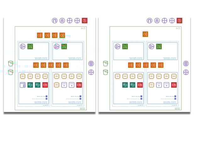
How long does it take to find the differences in the two diagrams above?
Detecting problems based on past history, which is documented and retained is far more effective than trying to establish historical changes from large spreadsheet or database table data sets. (that's assuming you managed to capture the changes in the first place)
Hava does the heavy lifting for you by scanning your cloud configuration whether it's AWS, Azure or Google Cloud and parsing the bottom up raw data and constructing a top down view of exactly what you have running. Then continuously polling and detecting changes.
You can start leveraging visual diagrams of your network and let your team detect potential issues with your environments using Hava. Maybe you have stale or unused resources still running that are costing your business money unnecessarily, or you have potential redundancy issues should an availability zone, region or un-replicated database go offline.
Whatever the anomaly, an automatically visualised network is the best way to spot potential problems or solve urgent issues causing an application outage. You can uncover the source of the problem using a diagram significantly faster that extracting configuration data to spreadsheets or trawling through console logs looking for answers.
On top of the incredibly useful network topology diagrams, Hava also has container visualisation, security group visualisation, and API access built in.
You can request a one-on-one demo of Hava at any time or click on the button below to take an obligation free trial.
When you take on a cloud infrastructure redesign project, the first job to be done is establishing what is running where and to get that documented....
What's the best automated tool for generating cloud infrastructure diagrams in 2023? If you are building on AWS, Azure, GCP, Kubernetes or all four,...
If you are managing cloud engineers, there are 7 incredibly great reasons to consider adding Hava to your engineering utility belt. We discuss all...