aws
Hava Self Hosted Cloud Diagram Generator
You can now deploy hava.io on your own cloud infrastructure. If you have security or governance policies preventing access to your cloud networks,...

Large complex cloud infrastructure is notoriously difficult to diagram accurately.
Establishing exactly what is running, where it is running, how resources are connected and how they are secured is an essential part of managing cloud infrastructure.
When your network is large and complex, the process of logging into multiple cloud consoles, establishing what is running, how resources are associated and then mapping out the environments can take days, sometimes weeks. Even small networks can be challenging.
Then of course things are changing all the time.
With a lengthy manual discovery and diagramming project the chances are by the time you finish, the ground you have already covered has already shifted. Autoscaled resources, new features or micro-services eagerly deployed in line with your CI/CD methodology leads to outdated documentation, even before you have finished drawing the initial diagrams.
There is of course a much better a way.
In this post we will discuss:
If you are not automating your AWS, Azure or GCP diagrams you are wasting valuable time.
Especially if you have large complex infrastructure to manage or you look after multiple client cloud accounts.
If you manage large cloud infrastructure deployments keeping up with documentation can be a full time job.
With things changing all the time, the need to communicate the current state of play with your existing team, new hires or other stakeholders within your organisation is essential. Not only does a clear picture of your cloud infrastructure get your team on the same page, but it also helps prevent mistakes and overspend on unnecessary resources.
Structural and security vulnerabilities are exposed to the light so you can mitigate risks before anything bad happens. This is a good thing.
The major stumbling block preventing every developer or ops team having accurate, up-to-date infrastructure diagrams always on hand is the amount of time it takes to initially produce them and then keep them updated when things change.
We understand the challenge. We've been there. Our team has a pro-services background.
Every time we took on a new client the very first job was to map out the existing cloud infrastructure. Depending on the size of the infrastructure, this could take days or even weeks. We had much better things to do than to spend days on Visio or a whiteboard, so we developed Hava to automate the process..
Whilst our pro services, cloud consulting business is long gone, Hava remains and continues to expand and grow, helping thousands of cloud engineers visualise their cloud infrastructure with out the effort of trawling through cloud consoles and manually mapping out diagrams.
By connecting your cloud accounts to Hava, a process that takes a minute or so, you receive a fully detailed accurate diagram for every VPC or virtual network running in the attached cloud account.
You can attach as many cloud accounts as your like from AWS, Microsoft Azure or Google Cloud. If you are running a hybrid cloud solution, or manage cloud infrastructure for thousands of clients, Hava handles everything for you. Attach once and the diagrams appear in your environments dashboard without having to open a single cloud console session.
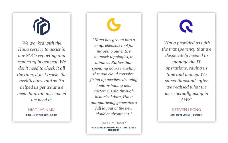
Typical feedback from active Hava users includes things like:

It pays not to underestimate the power of automation.
Remove the humans.
Or more accurately, remove the potential for human error by letting Hava automate the diagramming for you.
The thing about Hava diagrams is that they are drawn from the absolute source of truth, your cloud configuration.
Nothing makes it onto the diagrams that doesn't exist and conversely everything that is running is detected and placed onto the diagram. This makes Hava diagram as reliable source of factual infrastructure details, which is something you can present to auditors should you be subject to ISO / SOC / PCI or other governance audit requirements.
Hava's diagrams are up to date and can be relied on far more than the draw.io image your network architect created when the network was designed 2 years ago.
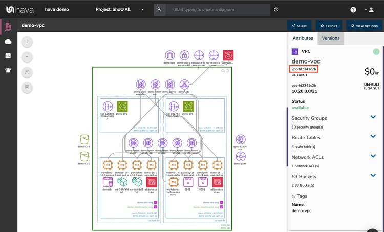
The interactive nature of the diagrams created by Hava automatically continue saving you time. On top of the initial build time, you can investigate settings and metadata directly on the diagram. You simply select a resource and all its known settings are displayed alongside the diagram without you needing to go off to the cloud console and try to track down the resource in question.
This means not only do you get to see everything that is running in your environments, but also how they are configured and secured.
Cloud infrastructure diagrams cease to be of any use when they are out-dated. That can happen the moment you create one.
With the dynamic nature of cloud deployments things can change fast. Maybe you have autoscaling groups rapidly changing in response to traffic spikes, or you have a prolific development schedule with dev teams rolling out incremental changes to your applications every day.
Whatever the reason, diagrams should always reflect the current state of play.
The good new is Hava keeps your diagrams up to date automatically. Hands free. There's no need to log into your Hava account and manually trigger an update. The background sync process automatically checks your cloud config for changes and updates the diagrams when a change is detected. This means when you log into your Hava account or view an embedded diagram on your intranet or wiki, you are looking at the very latest version of your cloud infrastructure.
Sync frequency increases with plan levels and you can use Hava's API, Terraform and Github integrations to trigger the addition and updating of infrastructure diagrams from directly inside your CI/CD pipelines.
Hava diagrams stay up to date automatically, without manual intervention, even if you haven't logged into your Hava account for a while. They will be ready and waiting.
Automation is great. You get diagrams created for you and then they are automatically updated when things change.
One potential problem is when more than one change has happened over a period of time and you haven't checked your diagrams for a while. If something isn't working as expected or you have seen a massive change in application performance or cloud billing you'll want to get to the bottom of it. You'll need to know what changed when.
Hava approaches this challenge by capturing superseded diagrams as they are replaced.
This means if there has been 5 major changes to your infrastructure since you last looked at you diagrams, there will be 5 new diagrams in version history chronologically detailing the changes.
This is pure gold when it comes to troubleshooting.
It's also very useful during audits. The auditors will most likely want to know what has changed since your last audit. Hava can retain this information for as long as you require,
The retained diagrams are also interactive.
This means you can sit two diagrams side by side and visually compare them to identify changes. You can also export both diagrams in CSV or JSON formats for programmatic comparison, which can be particularly useful when you are dealing with very large environments.
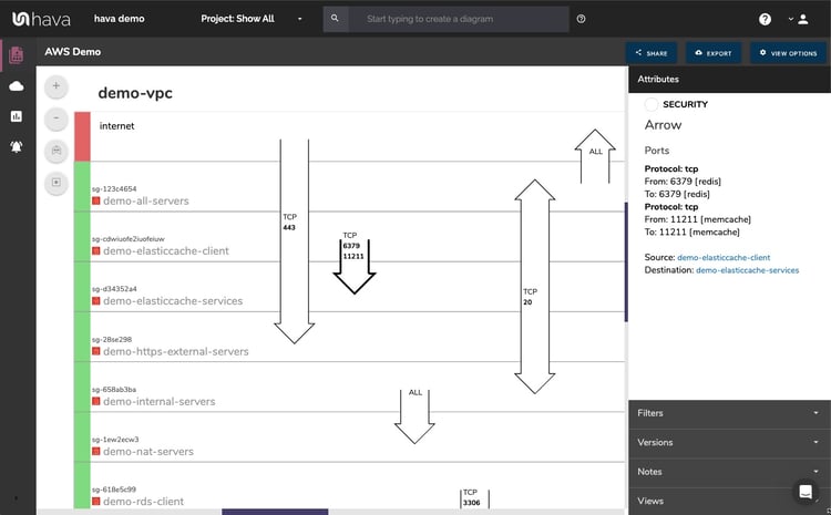
When you automate your cloud diagramming using Hava, your connected AWS and Azure accounts will generate a security diagram view for each VPC diagram.
The information that would take your security team equally as long to collate for your VPCs is auto generated for you,
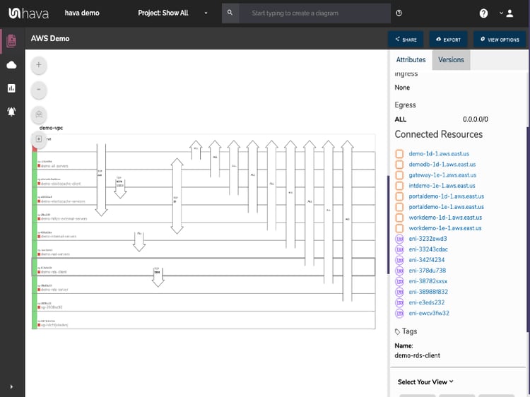
The diagrams show the configured security groups. The interactive nature of Hava diagrams means you can select a security group and a ton of information is returned in the attribute pane to the side of the diagram, like ingress and egress IPs, protocols, connected resources etc.
Overlaid on the diagram are the configured ports. The arrow show the source and destination of the traffic flow and the open port and protocol involved. This means your security team at a glance can see any configuration issues that might be causing a security concern.
Conclusion:
Hava allows you to start viewing cloud infrastructure diagram in minutes, a process that used to take days or weeks of intense analysis.
Multiply the time saved on a diagram with the number of environments or cloud accounts you manage and you will appreciate why so many leading dev teams turn to Hava for their cloud visualisation needs.
The Infrastructure view is a fully interactive diagram that show you your VPCs or Virtual Networks. Inside the VPC you have availability zones and subnets that show you what resources you have running and where they live.
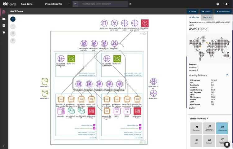
The interactive nature of the Hava diagrams eludes to the ability to select individual diagram components which changes the attribute sidebar to display all the known metadata related to that resource. This means you don't have to keep flipping backwards and forwards through your cloud consoles to find out the information you need about a highlighted resource.
Another view is the Security View. This is entirely unique to Hava and shows you the security configuration for your AWS or Azure VPCs
This view is also interactive and shows security groups horizontally with the open ports and protocols that allow traffic ingress/egress shown as arrows overlaid on the groups.
Selecting a security group on the diagram changes the attribute panel to show a ton of useful information including all the connected resource that security group controls.
If you are deploying containerised workloads on ECS EKS AKS GKE or stand alone Kubernetes clusters, you can leverage Hava's Container View to see the status of your pods or tasks in each cluster. While not as detailed as say the infrastructure view in AWS, you still get to see all your tasks and whether the run status is optimal or not.
There is an API that allows you to add and remove data sources, sync diagrams, set up and amend teams and projects and a whole host of other functions you might like to script instead of perform via the Hava UI
You can also leverage the many integrations like the Terraform, Github and Atlassian Confluence plugins.
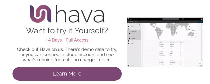
To take a look at Hava you can take a free 14 day trial using the button below.
You can import some demo environments or connect to one of your cloud accounts to see how everything works.
If you have any questions, please get in touch.
You can now deploy hava.io on your own cloud infrastructure. If you have security or governance policies preventing access to your cloud networks,...
There are numerous reasons why any organisation with cloud computing infrastructure should automatically generate documentation. Faster onboarding,...
Hava's cloud architecture diagram tool automatically visualizes your cloud Infrastructure, hands-free, no drag-and-drop required.