aws
Amazon AWS Diagram Maker
You can stop wasting your valuable time manually drawing your AWS network topology diagrams using this fully automated diagram maker. Find out how...
If you are using AWS to build solutions that consist of more than a handful of resources you will appreciate the need for accurate AWS VPC Diagrams. The best form of documentation to be able to easily communicate how your AWS network is constructed is a network topology diagram.
Laying out your VPCs, regions, subnets and resources in a VPC diagram allows you to see exactly what is running where and how your resources are connected. Which is invaluable when you need to identify problems or improvement opportunities or need to explain to new engineers or external consultants exactly how your network is built.
When your AWS VPC consists of only a few resources it is easy to create diagrams manually using a drawing tool by scouring through your AWS console to identify the resources you have provisioned and the regions and VPCs that have been used to contain them.

Once you start using multiple AWS accounts, utilise autoscaling, build multi region multi zone designs with potentially hundreds of provisioned resources, the task of manually creating diagrams becomes incredibly complex and massively time consuming. One of the first tasks we undertook when providing expert cloud consulting services was to map out a new client's network topology which is why Hava was built.
Once you let humans into the loop, the potential to make diagram errors is ever present and the automated nature of various AWS services means that your network can be changing all the time, so keeping your documentation up to date and accurate can be almost impossible.
The obvious solution is to automate the process using hava.io. Hava was created by expert cloud consultants who needed a method of quickly visualizing client cloud infrastructure so the actual work of improving and redesigning could begin.
With accurate AWS VPC Diagrams of your AWS network topology, you can spot vulnerabilities like availability zone redundancy issues and security issues like open ports and unsecured resources.
Automated discovery of your AWS resources can also surface orphaned and obsolete resources that should have been deleted. Usually this is a result of legacy apps or testing environments that were never shut down and are going unnoticed and are buried in your AWS billing account.
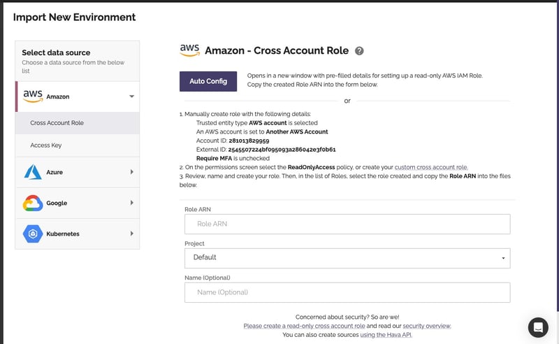
Getting started with hava.io is simple. Following AWS best practices, all you need to do is create a cross account role in AWS and use it to connect to your Hava account.
Once connected, the hava application will read your console configuration settings and build diagrams for each vpc or serverless cluster discovered. (At no time does Hava read the contents of your databases or file systems).
Any data that is stored in order the draw the diagrams is encrypted both in transit and at rest.
There are several AWS diagram views created when you connect to Hava.
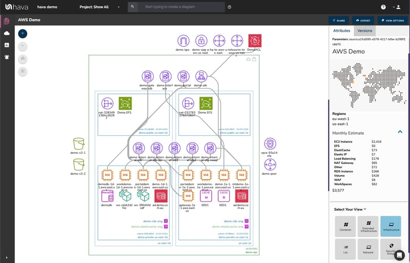
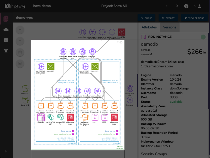
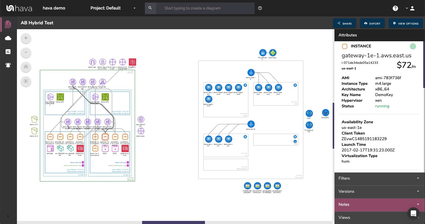
The AWS infrastructure view is your primary AWS VPC diagram. It shows a VPC (the green box). The vertical dotted line columns represent the availability zones in use and within these are your subnets (the blue rectangles).
Clicking on the VPC, an AZ, a Subnet or an individual resource icon will reveal an attribute pane on the right hand side of the diagram containing all the metadata related to the selected item.
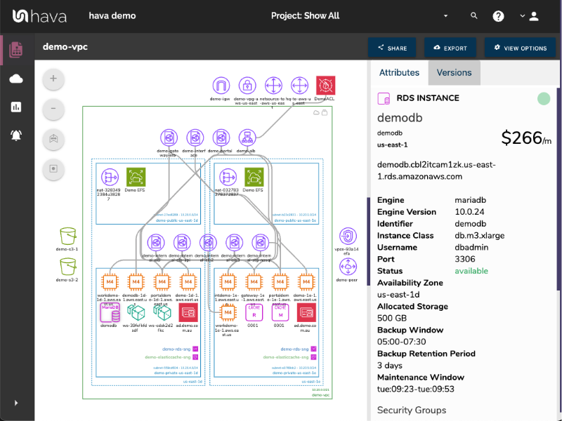
The strategy behind the attribute pane is to keep the diagram as clean and readable as possible. If we attempted to place all the key metadata related to the resources on the diagram, it would soon become messy and unreadable.
Hava does not have an edit function, it will only diagram resources that actually exist. This is to maintain the integrity of your diagrams as a source of truth. What is running in your AWS account is what appears on your diagrams. This makes them an invaluable resource when faced with compliance or audit questions and enables you to be confident that the network you designed has been correctly provisioned. There can be no suggestion that resources on the diagram were not running, or that resources were running that are no longer on the diagram.
That said, it is possible to export hava diagrams in a number of formats:
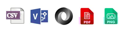
PDF and PNG hard copies of you diagram can be used for presentations, reports or interesting wall hangings in the office. The CSV export contains all the resources that you can import into spreadsheets or use for diffing or other analysis.
The VSDX files are the starting point for external editing. You can use Visio or a compatible editor like draw.io (either online of offline). When ingested, all of the diagram components are editable, so you can remove, add, annotate or draw whatever you like onto the diagram.
This is especially useful if you want to take your existing infrastructure as a baseline for proposed changes to your AWS network. Keeping the editing outside of Hava maintains the integrity of your diagram history.
Just as creating diagrams manually can be a time consuming labour intensive task, keeping those diagrams up to date can be equally time consuming. With dev teams pushing infrastructure as code on a regular basis, or auto scaling operations adding and removing resources at will, it's no wonder the majority of dev teams admit to not keeping on top of their network diagram documentation.
Once you connect Hava to your AWS account, your diagrams will be kept up to date automatically.
When things go wrong and your application(s) stop working as expected, you need to find out what caused the outage as soon as possible. When Hava detects changes in your network infrastructure it creates a new diagram and places the superseded version into a version history.
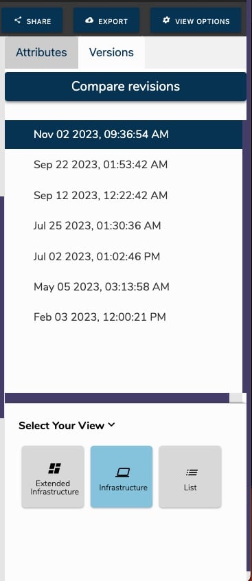
This means you have an audit trail of all the changes in your network. You can pull up the previous version to see what was added, what was removed or what changed.
You can also respond to historical enquiries, like the accounts team asking why the AWS bill doubled in March. Having two diagrams side by side makes easy to visualise the changes, or you can export both the current and previous diagrams in CSV or JSON to compare them programatically.
Hava continuously scans your AWS architecture and when changes are detected a new diagram set is automatically generated. The superseded diagrams are not discarded or overwritten. Instead they are moved into version history. Still fully interactive.
What this means is you can view your cloud architecture at any point in time and also leverage Hava's revision comparison (Diff Diagrams) to quickly identify what has been added or removed between the two diagram dates.
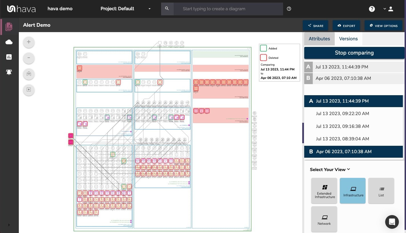
So you can easily identify all the changes made since your last compliance audit, or see what changed yesterday that is causing unexpected network or application errors.
While diff diagrams are super helpful in diagnosing changes after the fact, you may want to keep on top of changes as they happen.
Hava's architecture monitoring alerts will let you know the minute a change is detected. You simply nominate the environment you wish to monitor and add a group of recipients to receive the alerts. When a change is detected like the addition or removal of a resource, Hava will send each recipient a diff diagram showing the changes.
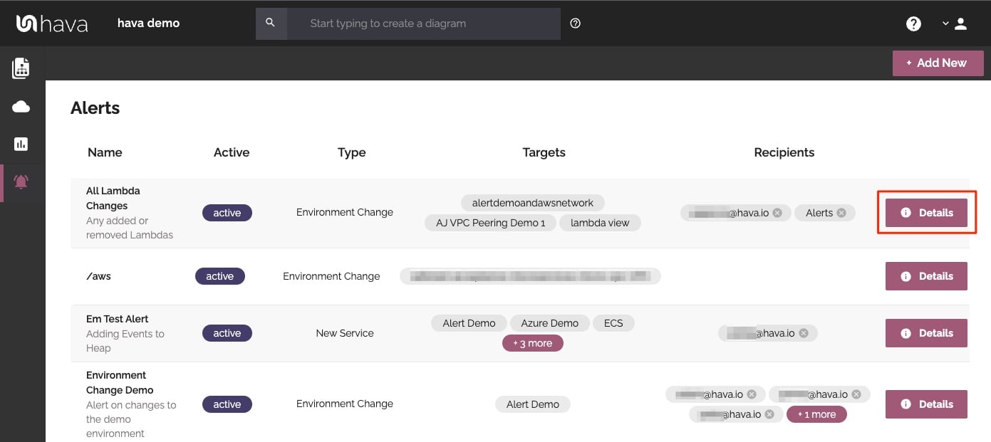
Now you and your security team can be across every change as it happens so you can assess and take action if required.
The next view is the Security Group view. This diagram lays out all your security groups down the page and overlays the open ports and traffic ingress/egress so your security team can visually assess vulnerabilities.
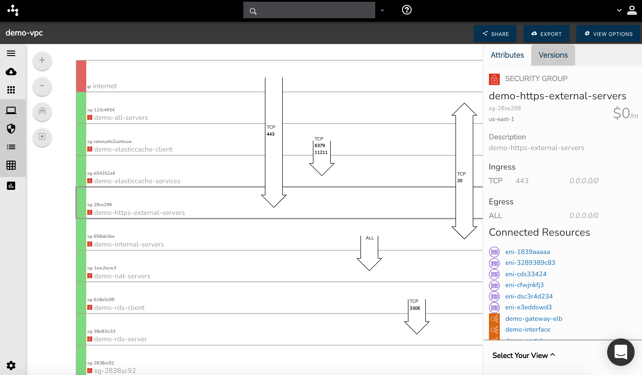
Selecting a security group will change the attribute pane to show the group's metadata and all the resources connected to the group. Security diagrams are also sent to version history once they are superseded, which gives your security team accurate data during an audit or security event.
The next diagram automatically generated by Hava is the Container View. This diagram lays out detected ECS clusters.
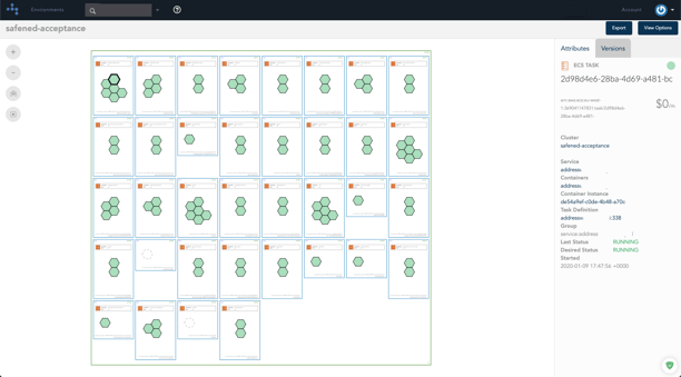 Within the cluster you will see all of the ECS services which contain individual ECS tasks.
The tasks are colour coded so you can see the status at a glance and when selected you can view the cluster and service details, container instance name, task definition and so forth.
As well as AWS, Hava also supports Google Cloud Platform and Microsoft Azure. You create GCP and Azure diagram sets in much the same way as AWS. Once connected you then have the ability to create Hybrid diagrams. These could be multiple AWS VPC Diagrams, subsets of resources, like a specific tag or diagrams from multiple vendors.
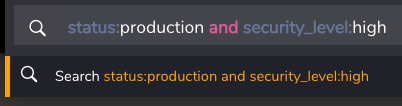
If you have an application that uses both AWS and GCP/Azure for instance, you can use Hava's custom query diagram builder to pull in all the resources from both platforms related to the application or project.
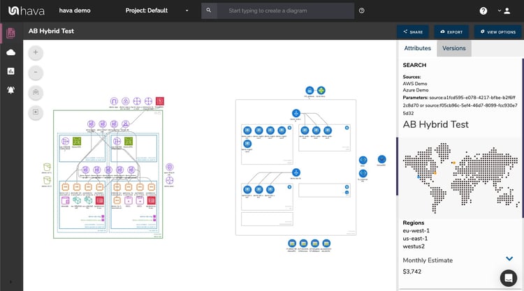
Once you save the hybrid diagram, Hava will keep it automatically up to date and will maintain a version history just like the auto generated diagrams.
You can build diagrams for subsets of data like a specific tag pair, or you can join data from different AWS accounts, different vendors and specific resource types.
For instance, your database administrator could create a single diagram of all of your databases across all your AWS/GCP/Azure accounts to keep an eye on the status and utilisation without having to jump around to different consoles.
Typically you need to provide a log in to users in order to view your Hava diagrams. It is possible however, to embed diagrams into properties that support iframe embeds.
This means you can make VPC diagrams available in your intranet, a wiki or even a Jira ticket so that other team members can view the interactive network topology without consuming a user log-in.
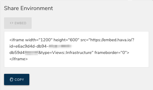
Each diagram has a 'Share' button that will generate an embed code snippet you can drop anywhere you like. Obviously there is potentially confidential infrastructure information contained in your diagrams, so embeds should be used with caution.
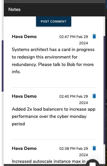
For every architecture diagram generated you have the ability to add text comments. This serves as a rolling dialogue your team can contribute to that may better explain elements of the diagram or bigger picture concepts related to the diagram.
Notes are accessed from the accordion menu within the attribute pane.
New notes are added to the top of the list so they are stored in chronological order.
Hava has a fully featured API to let you create, pull, export, add datasources and integrate documentation artifacts into CI/CD pipelines.
So if you want to get back your precious time and possibly your sanity, you can say goodbye to manual diagramming forever by adding Hava to your cloud development toolbox.
Hit the button below to learn more:
You can stop wasting your valuable time manually drawing your AWS network topology diagrams using this fully automated diagram maker. Find out how...
What goes into producing the ultimate AWS diagram. Automation, simplicity, flexibility, and the ability to track and document changes as they happen...
Hava's AWS Infrastructure Diagram Generator automatically generates your AWS Infrastructure Diagrams, hands-free, no drag-and-drop required. Diagrams...