As more companies turn to the cloud to host critical business applications, mass cloud adoption brings with it a new set of challenges.
You might be involved in a large organisation with offices spread over the country or across the globe, or you might be a managed service provider or pro services consultancy with hundreds of clients who in turn have branches or offices distributed across the globe.
It's likely that for the clients or infrastructure that you are managing, each location has unique solutions, tools and applications they are running to meet their business needs. It doesn't take long for the number of cloud services and resources to scale and become difficult to manage from a technology or budget perspective.
This issue is only compounded when you are an MSP or consultant managing multiple client networks. While each individual account might be manageable, when you add them together, keeping on top of the running resources, ensuring legacy or obsolete resource instances are killed off in a timely manner and unnecessary regions and replications are removed can be difficult and easily ignored.
Unneeded regions, oversized resources, unused services, legacy environments that sit there untouched for years can all add up to a massively overblown cloud spend month after month.
As a business transitions through cloud adoption, to migration and fine tuning and scaling their established networks, sooner or later their thoughts will turn to cloud estate rationalization and you as their MSP or professional services provider will most likely make it your business to do the same.
From a FinOps perspective, it is glaringly obvious that you and your clients should understand exactly what is running in your cloud accounts, what is the purpose of each service or resource and how do they contribute to the business outcomes of your organisation or client.
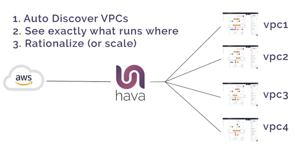
The first step in understanding your digital real estate is to use a tool like Hava to scan and diagram exactly what is running in any given cloud account. The advantage of scanning and auto generating diagrams apart from the obvious time savings is the fact that your diagrams detail exactly what is running now.
Take for instance AWS infrastructure. When you connect an AWS account to Hava, the application will scan the account configuration and produce a diagram set for each VPC discovered, showing the regions in use and subnets in the VPC. So instantly you get to know about all the VPCs running, including any dev or test environments or snapshots that may no longer be required.
Having your client's cloud estate laid out like this can be the start of many conversations. What are the income producing networks and should they be scaled?, what does that look like? What infrastructure is no longer required?, or what resources are undersized, or oversized.
Just as the diagrams produced by Hava can be the start of the conversation, especially with a brand new client, they can also be a useful validation of your work. A visual depiction of a completed network provides transparency. You can easily show your client what you have built and what they now have running along with cost estimates. You can easily embed interactive cloud network topology diagrams directly into their intranet or company wiki so they can see exactly what their network(s) look like.
Knowing exactly what is running everywhere, you can demonstrate to all your customers how the services and resources you have running match their desired business outcomes. And if they don't, you have a great starting point to understand what can be scaled in or out or what can be added or removed.
You can see and explain when there is more work to be done to remediate excessive cloud spend by rationalizing the deployed cloud resources in both your own and your client's cloud accounts.
You can use Hava to map out what is running in AWS, Azure, and GCP automatically. Once generated, Hava's diagrams stay up to date automatically, retaining superseded versions for audit purposes.
AWS NETWORK ARCHITECTURE DIAGRAMS
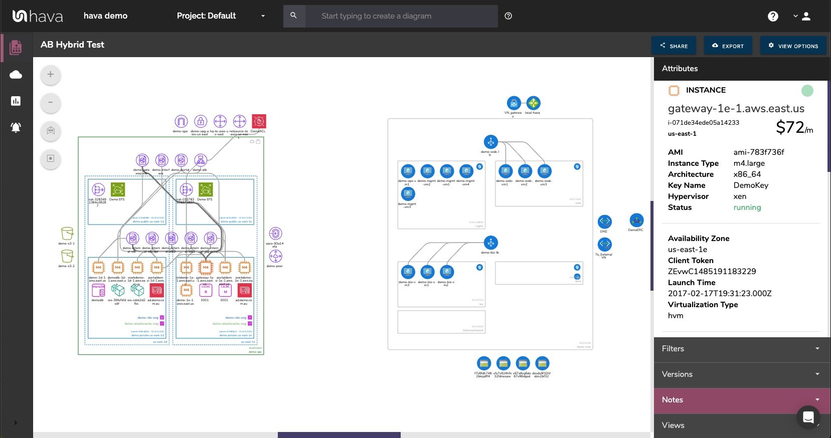
There are a number of Hava diagrams that can prove useful to your engineering and DevOps team. These include an AWS Infrastructure diagram like this:
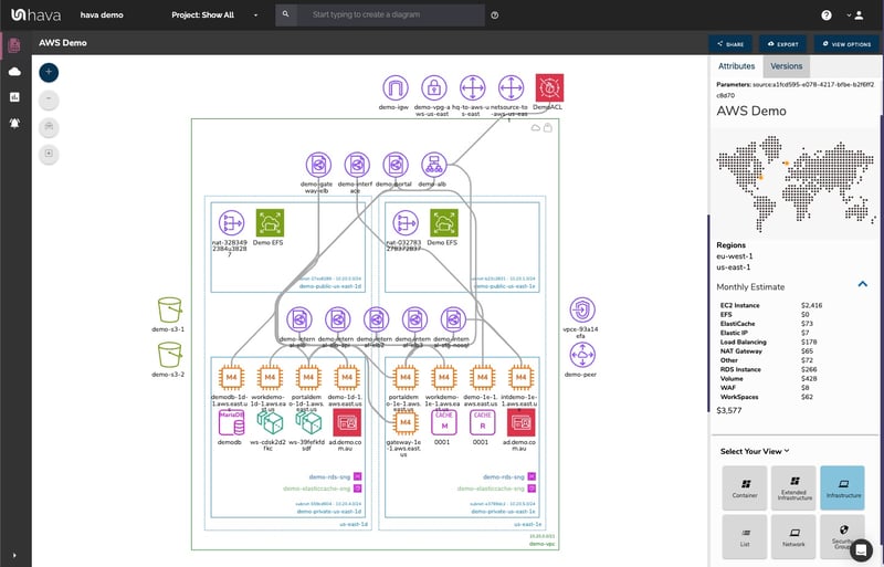
The above diagram example logically lays out all the resources discovered when an AWS account is connected to Hava's AWS Network Diagram Generator. The main VPC denoted by the green border, is surrounded by associated resources like internet and VPN gateways, S3 Buckets, VPC endpoints, VPC peering connections, Elastic Beanstalk environments and so forth.
Within the VPC, the configured availability zones (AZs) are set out in columns that contain the individual subnets set up in those AZs. All the resource instances contained in each subnet are visualized, as are any load balancers routing traffic to the various subnets.
When you have a diagram automatically created from configuration data, now you can interrogate of each of the resources to see the settings and associations related to it. By clicking on any of the individual instance icons, the attribute pane on the right then displays all the known details related to the resource. Something that simply isn't possible with manually created drag-and-drop diagrams.
Automating the diagram build using an AWS Network Diagram Generator can also reveal resources you are paying for, but may not be aware of. Long forgotten database instances and sometimes entire dev or test environments are regularly discovered by this automation process. One of our clients discovered a database instance that was unused and costing close to $3k per month, and had been for over 3 years!
CUSTOM AWS NETWORK TOPOLOGY DIAGRAM
There is always somewhat of a compromise when it comes to automatically generated documentation. The way that Hava discovers and builds diagrams is based at a VPC level. If more than one VPC is detected in your AWS cloud account, then one diagram set per VPC is created.
You may however want to combine two or more VPCs onto a single diagram, for instance if they both relate to the same project or application. This can be achieved using the custom query search function built into hava.io.
AWS NETWORK TOPOLOGY DIAGRAM GENERATOR
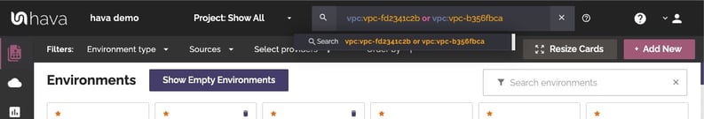
This custom query would create a new 'on-the-fly' custom diagram containing the two nominated AWS VPCs specified in the search. You would then have the ability to save this diagram so it is retained in your dashboard until you choose to delete it. As with all other diagrams generated by Hava, your custom AWS infrastructure diagram would keep itself up to date and retain a version history every time a resource change is detected.
AWS RUNNING COMPONENTS DIAGRAM
Typically it is just not practical to include every single component onto an AWS network diagram. Take for instance network interfaces, volumes or WAF Rules. In a large network with hundreds or maybe thousands of these non essential components, trying to map out every single component would most likely make the diagram unreadable, or certainly too rammed full of unimportant resources to easily recognise the core components.
However, that's not to say you don't need to know about them.
Hava solves this issue by providing detailed components list that lists out every single resource detected.
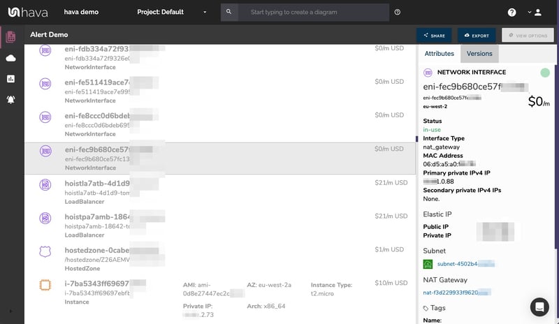
This comprehensive list of resources can also be sorted and exported along with estimated monthly costs so you can see at a glance what resources are costing you the most money. This detailed view is also interactive. Selecting a resource on the diagram will reveal all the known settings and associations that resource has.
AWS SECURITY GROUP DIAGRAMS
Another benefit of automating the discovery of your AWS environment diagrams with Hava is the ability to capture and visualize security group, traffic and open port details.
AWS SECURITY ARCHITECTURE DIAGRAM
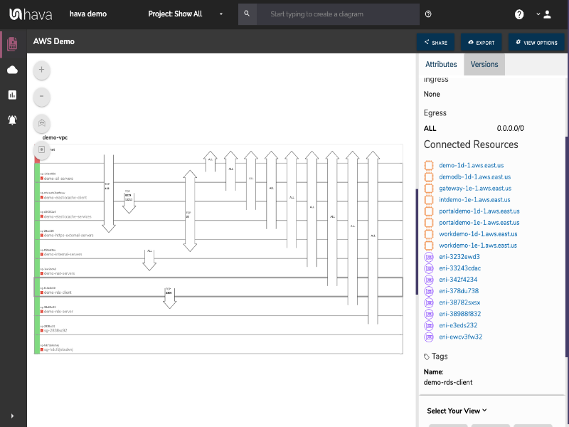
With the Hava security group diagram you can view all of your configured security groups with the open ports overlaid to enable an instant visual snapshot of the traffic flow, ingress and egress points. The security group diagram being interactive ensures you can select a particular security group on the diagram and view important information relating to the group, like the connected resources, ingress and egress ports, IP addresses and associated tags.
AWS ARCHITECTURE DIAGRAM VERSION COMPARISON
Hava continuously scans your AWS architecture and when changes are detected a new diagram set is automatically generated. The superseded diagrams are not discarded or overwritten. Instead they are moved into version history. Still fully interactive.
What this means is you can view your cloud architecture at any point in time and also leverage Hava's revision comparison (Diff Diagrams) to quickly identify what has been added or removed between the two diagram dates.
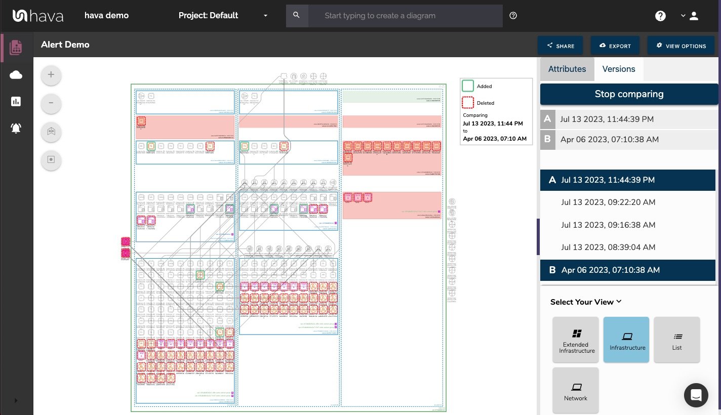
So you can easily identify all the changes made since your last compliance audit, or see what changed yesterday that is causing unexpected network or application errors.
AWS ARCHITECTURE MONITORING
While diff diagrams are super helpful in diagnosing changes after the fact, you may want to keep on top of changes as they happen.
Hava's architecture monitoring alerts will let you know the minute a change is detected. You simply nominate the environment you wish to monitor and add a group of recipients to receive the alerts. When a change is detected like the addition or removal of a resource, Hava will send each recipient a diff diagram showing the changes.
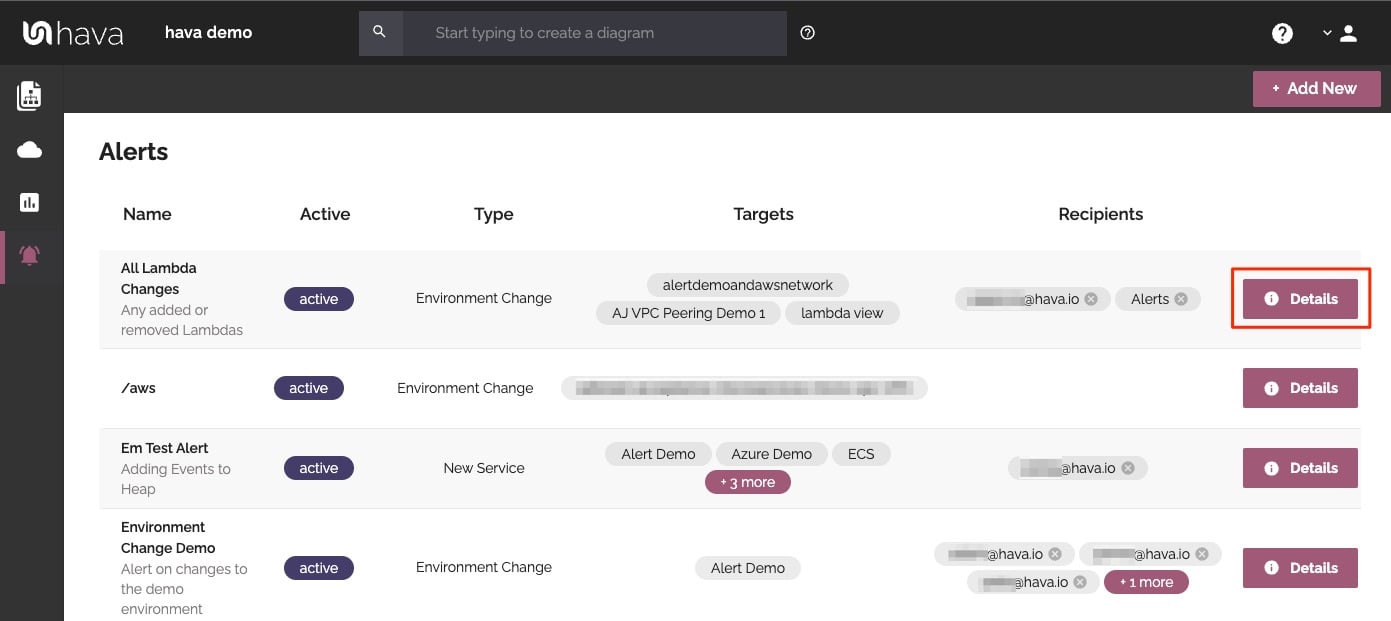
Now you and your security team can be across every change as it happens so you can assess and take action if required.
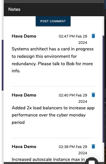
ENVIRONMENT DIAGRAM NOTES
For every architecture diagram generated you have the ability to add text comments. This serves as a rolling dialogue your team can contribute to that may better explain elements of the diagram or bigger picture concepts related to the diagram.
Notes are accessed from the accordion menu within the attribute pane.
New notes are added to the top of the list so they are stored in chronological order.
AUTOMATED AWS DIAGRAM UPDATES
Finally, your documentation is only useful if it is accurate. It is quite possible to spend weeks manually constructing network topology documentation only to have it rendered useless by a minor change to your network configuration.
In the middle of an outage or network incident that has taken down your application, being able to quickly establish what should be running is crucial.
Built into Hava is an auto-sync function that polls connected data sources and automatically updates diagram sets when changes are detected. This means your diagrams are always current and up to date. The superseded diagram sets aren't discarded however. They are placed into a version history that enables you to pull up older diagrams in the same fully interactive format.
This allows you to quickly and visually identify changes to your cloud network topology, so you can easily compare a previously working set of network resources with the current configuration to see what's missing .
It also allows you to demonstrate the status of your network at any point in history. This can be invaluable during a pci compliance audit or insurance claim should your network design ever be called into question.
EXPORTING GENERATED AWS DIAGRAMS
Native AWS architecture diagrams created by Hava are the nearest we've seen to the examples and recommendations provided by AWS. These are great to view and interrogate via the interactive dashboard, however sometimes you'll need to pull a set of diagrams for audit purposes or for management or sales presentations.
Hava's built-in export function allows you to do this in a number of formats.
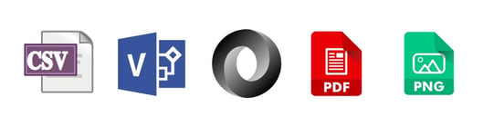
CSV, VSDX, JSON, PDF and PNG
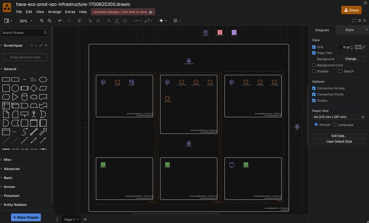
EDITING AWS NETWORK DIAGRAMS
Should you want to manipulate or embellish your Hava generated diagrams, exporting to VSDX format and using Visio, draw.io or any VSDX compatible drawing package will allow you to edit your diagrams as required.
Should you not have access to Visio but would like to try this out, try opening one of your exported VSDX files in draw.io
Getting Hava to do the bulk of the heavy lifting by initially generating accurate diagrams based on what is actually configured and running in your AWS environment enables you to access a base diagram ready to edit which will save you hours or possibly days preparing management reports or upgrade plans.
You can take the fully featured "teams" plan for a 14 day no obligation free trial using the button below.
Hava is available online as a SaaS solution, or can be self hosted on your own infrastructure should you have governance or security policies preventing you connecting to the SaaS application.
If you have any questions or you are an enterprise or team that would like a 1:1 live screen share demo, please get in touch.