aws
What is Amazon AWS Skill Builder?
AWS Skill Builder is a repository of hundreds of free digital training courses to build your AWS cloud skills. In addition you can access labs, cloud...
Cloudscape Design System, is an open source solution from AWS for building intuitive, engaging, and inclusive user experiences at scale. Cloudscape consists of an extensive set of guidelines to create web applications, along with the design resources and front-end components to help streamline implementation.
Cloudscape was built internally for and is used by AWS products and services. AWS created it in 2016 to improve the user experience across AWS web applications, and also to help teams implement those applications faster. Since then, AWS have continued enhancing the system. Cloudscape was used to create the AWS Management Console, so you may already have used a cloudscape product without knowing it.
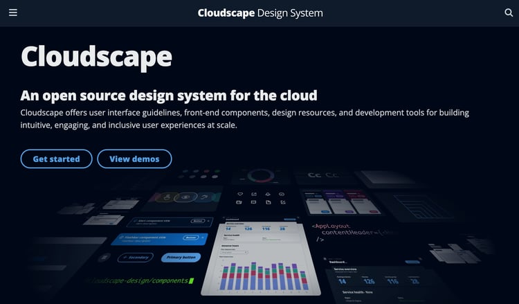
AWS have released Cloudscape as open source so that anyone building cloud products can benefit from Cloudscape design system, and also join a community of designers and developers who continually improve it.
There are 60+ components, 30+ pattern guidelines, and 20+ demos as well as theming, dark mode and content density to help produce and customise your UX
Whether you’re building a product that extends the AWS Management Console, designing a user interface for a hybrid cloud management system, or setting up an on-premises solution that uses AWS, Cloudscape offers a solid base to start your development.
CDS has at the heart of it a visual design foundation that utilises components and patterns that leverage consistent color palettes, icons, spacing and motion to deliver an attractive user experience. CDS also uses core principles to address responsive design and accessibility.
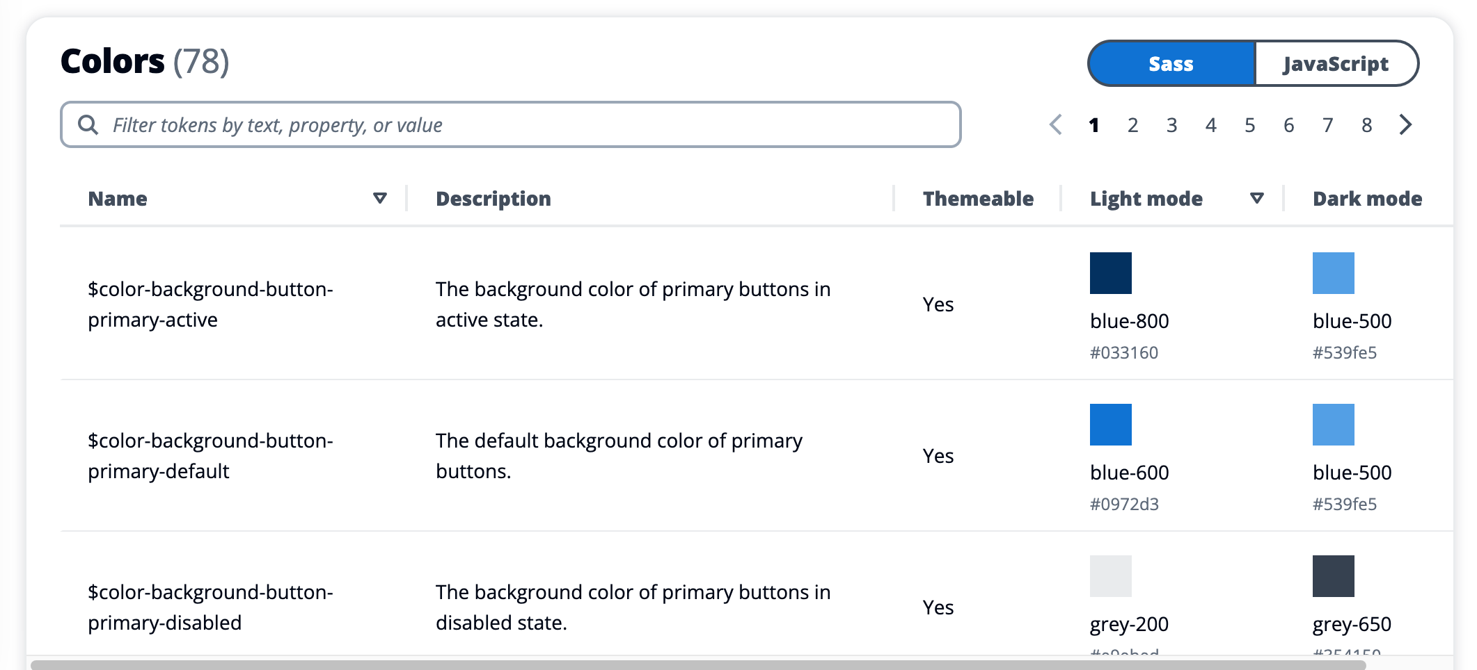
Foundation Colors
There are two sets of colors for light and dark mode design. Each color has a specific use, for example in Light Mode:
White #ffffff is used for:
Red-600 #d91515 is used for:
The full list of foundation colors for both light and dark modes can be found in the CDS foundation color chart
Foundation Content Density
Content density allows your application to adjust the amount of content shown on the screen based on the user’s preference. Some users may prefer more spacing between on screen information while others may prefer more information on the viewable screen area.
CDS supports two density modes, compact and comfortable. Compact increases the amount of data you can see on screen by reducing the spacing between screen elements. Comfortable is the default density which has larger spacing between elements for easier readability and cross device experience.
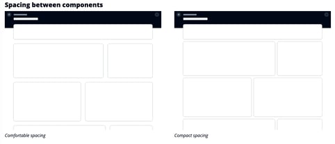
Content density is designed to ensure a consistent and predictable UX. Compact mode should be used to reduce spacing and scale to all components in all views, however comfortable mode should also be made available so users can select between the two.
Foundation Data Visualization Colors
When visualizing data, different color combinations can augment or highlight the significance of the data set.
The Status and Severity Palette uses colors to indicate the level of severity of the observed data. The colors range from red through to orange, yellow and green to show the severity level and also uses blue and grey to indicate a neutral status
A Generic Categorical Palette has 50 colors used in combination to provide contrast in charts and can be used to build custom palettes for your application.
The Threshold Color Palette contains colors to help define thresholds on line and bar charts and use the colors to reinforce the significance of the threshold. Red-600 for instance can be used to indicate negative outcomes if the threshold is exceeded, whereas green-600 represents a threshold where when exceeded indicates a positive outcome.
Design Tokens
A design token is a representation of a visual property like a color, size or animation. Instead of using hard coded values like a hex code for a color, a design token is a key-value pair that represents re-usable design decisions and is stored as a variable at the system level.
This means you can include the key within your code, while the value of that key can be changed at a system level, or at runtime. This could be used to provide end users with the ability to select different themes while the code base remains unchanged.
Before settling on design tokens as a solution and installing the design-tokens package, there may already be cloudscape components already available to do the job, so it’s recommended you check first. Tokens are available as Sass variables like $color-text-body-secondary or as Javascript ie: colorTextBodySecondary.
There are currently over 70 predefined tokens in the design tokens list
CDS comes with a large selection of Icons in four display sizes.
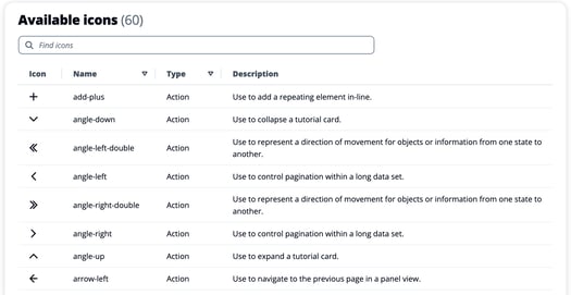
The full set of available icons can be found in the CDS Iconography page.
CDS uses a grid system to organise objects within your page layout. Grids set out the spacing and size of objects on a page providing a consistent set of rules that can be used for spacing, typography and iconography.
CDS uses a 4 pixel base unit and uses increments of 4 to define the spacing and scale of elements on the page.
Typically in a grid system, content can be laid out using a hard grid approach, where elements are placed on a grid base line or a soft grid approach where elements are placed in positions relative to each other. CDS uses a soft grid approach.
The CDS app layout component is the starting point for a basic layout type. It includes navigation, a content area and a tools or help panel. The layout is divided into a collapsible left side region for navigation controls, a right side region for the help panel, a top region for page level notifications like flashbars and a content area where the main content for the page is places. The content area default is a fluid 12 column grid.
Elements can span across all 12 columns horizontally and grid components placed in containers so they act predictably on responsive page layouts.
Motion is the ability to animate components on the page to highlight key elements or desired interactions on the page. Elements can be scaled in or out to draw attention to the element. You can also fade elements to show or hide screen components or add sliding elements like a side navigation which can slide in from any direction.
You can define the duration of a Motion
Spacing is used to define paddings and margins of the on page elements and when kept consistent provide a predictable layout and user experience.
Spacing is primarily used for padding inside components and for spacing margins between components. There is a predefined CDS spacing scale:
Cloudscape Design System Theming
Theming allows for the customisation of visual elements or attributes across your application interface.
CDS comes with a default theme that you can use for your own products and applications.
A theme is applied across foundational elements and for consistency cannot be applied to just one component instance.
As previously discussed, theming is achieved by changing specific design tokens that dictate typeface and colors. Once token values are changed, the changes are reflected across the entire application.
CDS components are built with React and use the foundational design patterns and guidelines. All the prebuilt components are responsive and accessible.
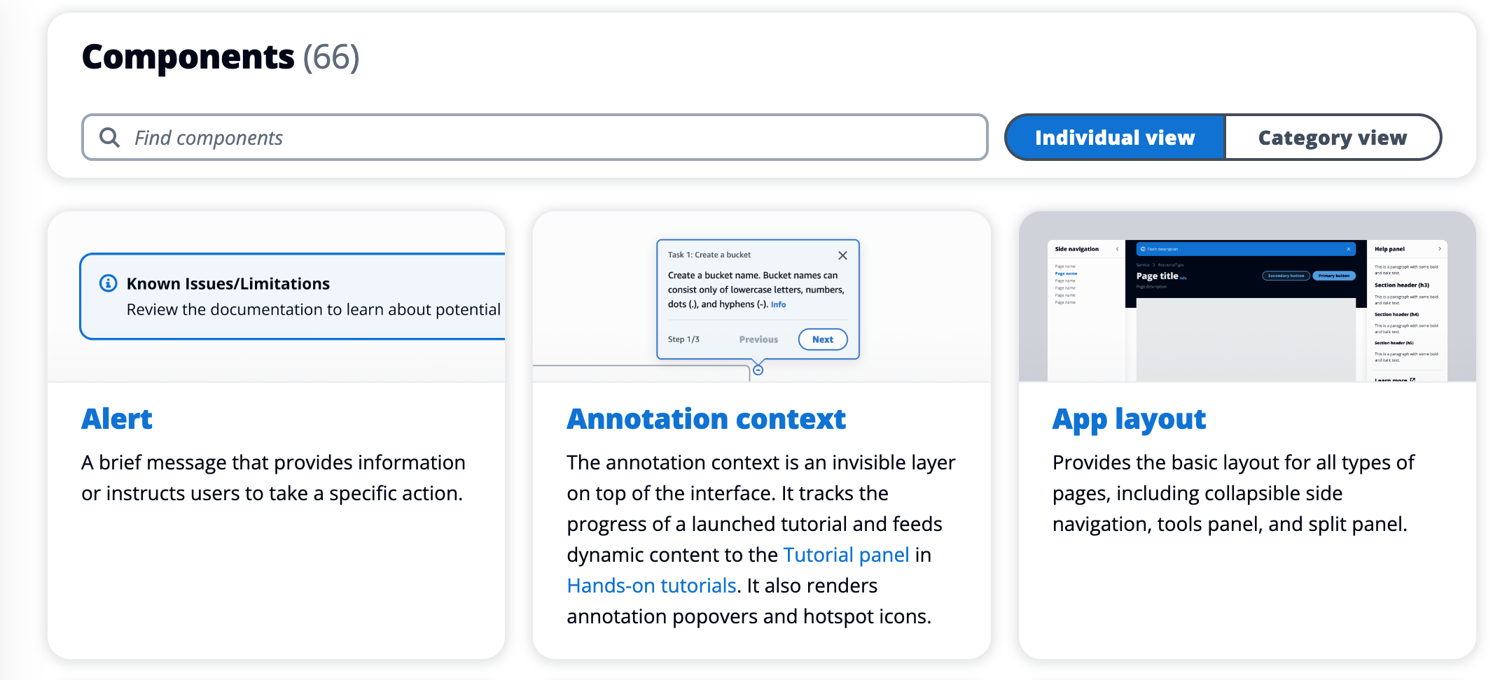
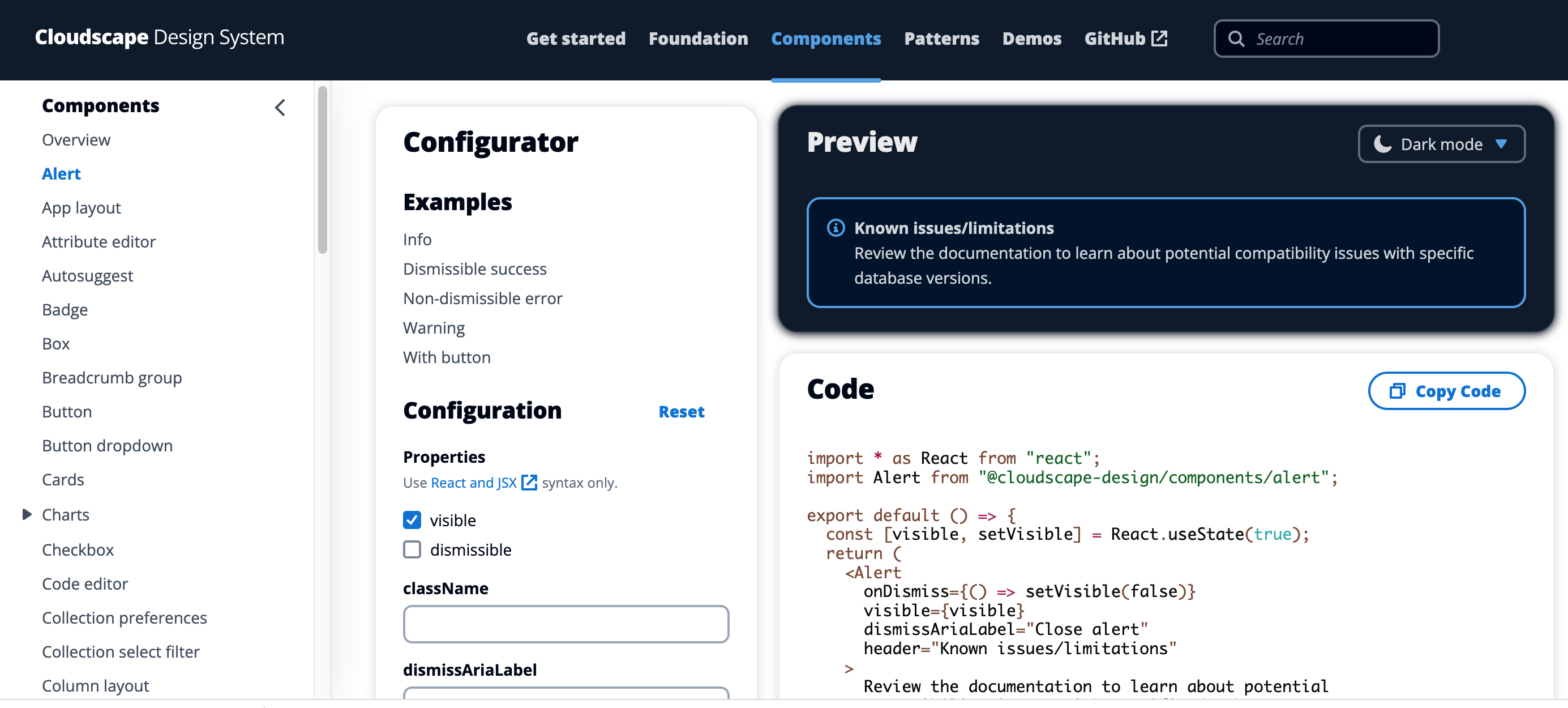
You can view all the available components on the CDS components overview page at the time of writing there were over 60 individual components like App layout, alert boxes, annotation context box, charts, autosuggest, attribute editor, badges, buttons, dropdowns, check boxes, code editor, date picker, content container, headers, icons, input boxes and the list goes on.
By selecting a component, you can test out the configuration and results in a playground as well as change the configuration and download the component code.
CDS patterns are predefined groups of components that are designed to solve common user problems or provide a method to help users perform common tasks or view information.
Some common patterns include data visualization, communicating unsaved changes, help, side navigation and so forth.
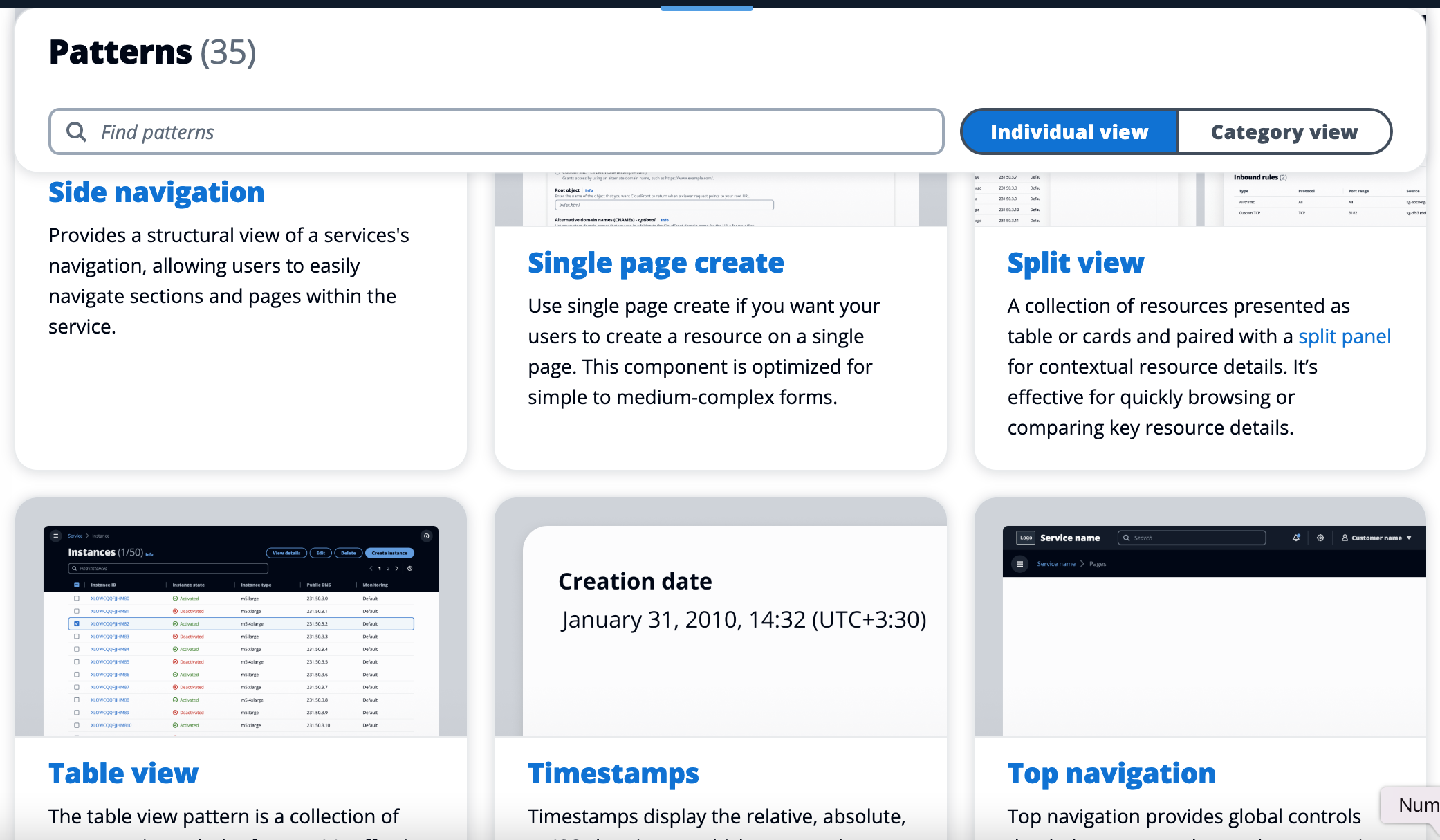
A full list of all available patterns are provided on the CDS patterns overview page
So that’s a quick look at Cloudscape Design System, an application design framework developed by AWS in 2016 to help standardise their web applications like the AWS Management console that is now open source and available for use.
If you are building on AWS or managing AWS cloud infrastructure, you can automate your network topology diagrams using Hava.
Simply connect your AWS account with a read-only cross account role and Hava will automatically generate infrastructure, security, container and compliance diagrams and then keep them up to date.
To learn more about Hava, follow the button below.
AWS Skill Builder is a repository of hundreds of free digital training courses to build your AWS cloud skills. In addition you can access labs, cloud...
In this post we take a look at the Security section of AWS Cloud Practitioner Essentials which covers what security measures AWS has built in and...
The AWS Cloud Practitioner Essentials Monitoring and Analytics module covers the AWS services available to ensure your AWS deployments are secure,...