gcp
GCP Diagram Automation
The quickest way to generate GCP diagrams automatically is to connect to Hava. Simply attach a Service Account and Hava auto generates diagrams for...
When you are building on Google Cloud Platform or working with applications built on GCP as a development or operations engineer you already appreciate the value of a well laid out network topology diagram that accurately represents what resources you have configured in your (or your client's) GCP accounts.
While there is very little argument that cloud network diagrams are an essential tool when you want to know what you currently have running or if you want to communicate the design of your network to consultants or new engineers, the problem has always been the time it takes to create a well laid out accurate Google Cloud Platform diagram.
Unfortunately the traditional methods of creating GCP cloud network topology diagrams have always been slow, tedious manual work involving transposing information from your GCP console onto a drawing canvas using drag and drop diagram applications like Visio.
The process usually involved getting your hands on a GCP icon set, working out what services and resources you have running, what virtual networks, zones and subnets are in use and then working out which resources belong to each virtual network. Very time consuming, mind-numbing work that no engineer we've ever met enjoyed.
Our engineers have a long history of cloud consulting and every time they took on a new client, they had to go through the tedious task of documenting the client's existing network so internally developed a toolset for automating this process. That toolset was eventually spun off into a stand alone application and business now known as Hava.
Hava allows you to connect your GCP accounts to the application which can be either SaaS or self-hosted and it automatically generates network topology diagrams and for each Virtual Network discovered.
Recently a few drawing application vendors have attempted to bolt on an import function to their drawing applications, however these appear to be a one-shot function, unlike Hava which continuously monitors the connected data sources and automatically updates diagrams when changes are detected.
This is all done hands free, no user intervention is required, but you always have up to date network infrastructure diagrams on hand whenever you need them.
Because your diagrams may well change several times in between you logging into Hava, the application retains all the diagrams that have been superseded in version history. So you have an audit trail of changes that have been made to your GCP environment should you be tracking down unexpected network behaviour or performance issues.
If you were relying on manually invoked diagram updates, you could possibly miss changes that have come and gone that caused the problem you are trying to investigate, which makes Hava's approach of continuously polling configuration data and auto generating diagrams a much smarter methodology.
When you leverage the power and accuracy of Hava to create your Google Cloud infrastructure diagrams on autopilot you only need to connect your GCP account once. That's it.
Hava can be hosted on your own infrastructure (self-hosted) or you can simply subscribe to a SaaS plan and be up and running in a minute or two.
Then it's just a matter of creating a Read-only Service Account and plugging that into Hava. The Service Account connection provides secure read-only access to console metadata which is what Hava uses to analyse running resources and construct diagrams.
So a minute or two of effort on your end, to create potentially unlimited GCP virtual network diagrams that stay up to date automatically until you disconnect.
So what do you get when you connect Hava to your GCP account, or indeed multiple GCP, AWS or Azure accounts.
The first diagram you get is the Infrastructure View.
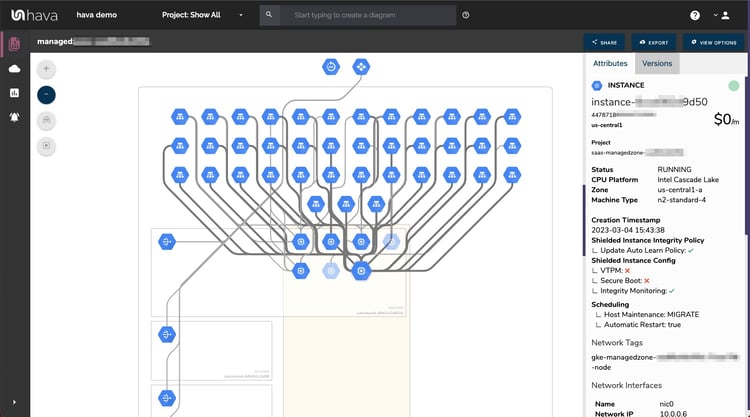
The GCP Infrastructure view lays out your GCP networks into separate diagram sets. Subnets within the Virtual Network are mapped within zones and detail resources both inside and outside the subnets and virtual network.
All the diagrams automatically generated by Hava are interactive. Which means, clicking on any of the resources on the diagram changes the attribute panel on the right of the diagram which allows you to take a deep dive into the resource settings like security groups, IP ingress/egress ports, connected storage and so on. The infrastructure view diagrams also display the estimated costs of each resource which are totalled for the entire environment when the environment is opened up.
All the diagrams created by Hava are kept as clean and readable as possible. By default, connections and resource names are not shown, however these can be toggled on like in the example below.
Right from inception, our engineers decided to keep the Hava diagrams clean and free from non essential resources like network interfaces that could flood the diagrams with lots of unimportant information making them messy and confusing.
Although these less important components are not on the infrastructure diagrams, we did need to know about these 'non-visualized' components, so we created the "List View". The List View is an extensive data set that lists all the resources discovered in your GCP configuration. This view lists both visualized and non-vizualized resources.
The listed resources also have an estimated cost detailed against them.
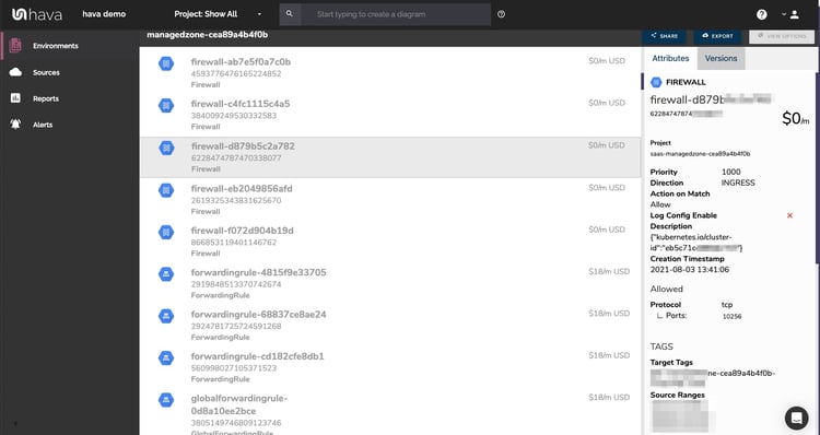
One of the benefits of this list view is the ability to sort the list, including by costs. This reveals what resources make up the bulk of your estimated cloud spend which should help when you are looking to save cloud costs or explain to management which important resources make up the bulk of your Google Cloud bill.
Now you have the ability to take advantage of the quickest way to create a GCP diagram.
Whichever diagram or view makes the most sense or delivers the information your team needs to build and manage your environments, the upside to using this hands free automatic Google Cloud infrastructure diagram tool like hava.io is that your diagrams are sourced directly from your GCP configuration, so nothing is missed out and nothing can be added by mistake.
What you see on the diagrams is derived from the source of truth, so your diagrams are always accurate and always up to date.
When your GCP configuration changes, so do all your diagrams, all automatically, all hands-free, no human interaction required. The diagrams that are automatically replaced are archived in a version history. You can open up the historical diagrams at any time you like. The diagrams are fully interactive so you can compare old configurations to new ones to find out what changed in the event of a problem or compliance audit.
The diagrams generated by Hava are also exportable. You can produce an GCP architecture PDF or a JPG for inclusion in your reporting as well as CSV and JSON.
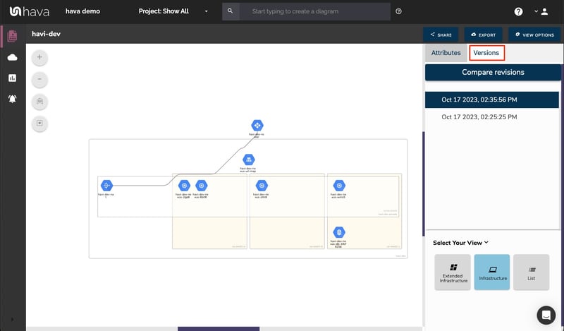
Hava captures diagram versions as changes are detected and new diagrams are generated.
You can select any two diagrams and view a revision comparison. This will show you what changed between 2 dates.
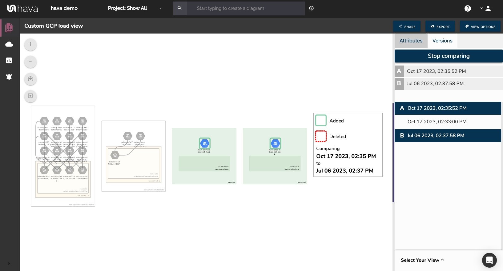
This means you can compare today with yesterday should you have an urgent problem you are trying to diagnose which may be the result of a resource change. You could also compare today with the same time last year in preparation for a compliance audit where the auditors are only interested in what has changed since your last audit.
When changes are detected in the configuration of the cloud accounts you are managing, Hava can trigger an alert that lets your know when that change is detected.
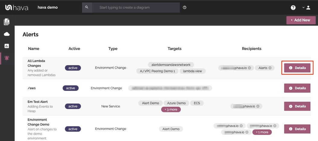
This means you always know what is happening in your cloud accounts and for MSPs it means you can let clients loose on their own infrastructure and resources but you can keep an eye on the changes and can warn them of any security or cost implications of the deployed changes - no more bill shock!
There are currently two options for using Hava to generate your cloud infrastructure diagrams.
Option 1: SaaS
The SaaS option is by far the quickest and easiest way to start visualizing your GCP cloud infrastructure.
You simply create a GCP service account with read only permissions, then log into hava.io and connect your GCP account. Hava will read your GCP config data and render the diagrams and start to track any changes for audit purposes.
A 14 day fully functional trial is available (along with demo data) so you can try Hava for yourself. At the time of writing, no credit card is required to take the trial.
Option 2: Self Hosted
The self hosted option allows you to run Hava from within your own infrastructure. If you have particular security or enterprise policies that prevent the connection of 3rd party applications to your cloud environments, then self-hosted may be the solution.
Both options are identical in functionality, but you will need to contact our support team to organise a self-hosted solution.
As well as using the application console to generate and view diagrams, Hava has a fully featured API that allows you to programmatically add and remove data sources, projects and diagrams.
We recommend requesting a one on one demo with our sales team if you would like to see Hava in action and explore the self-hosted option.
You can contact us via sales@hava.io or learn more about Hava here:
The quickest way to generate GCP diagrams automatically is to connect to Hava. Simply attach a Service Account and Hava auto generates diagrams for...
The quickest way to auto generate GCP diagrams is to connect to Hava. Simply attach a Service Account and Hava auto generates diagrams for every...
The quickest way to create an AWS network infrastructure diagram is to connect to Hava. Simply attach a cross account role and Hava auto generates...