aws
Cloud Infrastructure Charts
Cloud Computing Infrastructure Charts are an essential part of cloud computing from an Engineering, DevOps and Management perspective. Here's why...

Given our world here at Hava completely revolves around producing cloud computing diagrams, you can imagine we've got some fairly strong opinions on what makes a great diagram and the best way to go about creating them.
The cloud computing landscape is becoming increasingly complex which isn't getting any easier as the adoption of multi-cloud infrastructure becomes inexplicably more popular.
Discovering and documenting all the resources and their respective settings across multiple cloud consoles can be a daunting prospect especially if you are taking over infrastructure as a new engineer or consulting for a new client.
The first major problem is accuracy. More often than not, there will be no documentation, or if there is, it is so out of date that it cannot be trusted. Accurate diagrams communicate at a glance how infrastructure is configured so it is essential that reality is reflected on the documentation.
The second issue is time. Manually drawing and mapping out client or application infrastructure can take multiple team members days or weeks for particularly complex environments.
The third issue is keeping your diagrams up to date. With today's technologies utilising autoscaling and easily deployed infrastructure as code approaches, the chances are your environments are rapidly changing and scaling/descaling as loads and traffic dictate. Automation makes it easier to respond to network load requirements, but adjusting and updating your infrastructure diagrams to reflect the changes is often overlooked and can be expensive if you are engaging external consultants to do this work.
The use cases for creating and maintaining accurate network topology diagrams are compelling.
The first is ease of internal communication. If you are onboarding a new engineer then being able to show them the network in diagram form will immediately convey what is running and how it all hangs together. This is done in seconds instead of hours or days of tedious research looking through console settings.
The second is ease of external communication. From a governance perspective having accurate diagrams to demonstrate the state and structure of your network is important. Should you be subject to PCI compliance audits or questions around data protection or integrity, having accurate documentation on the state and design of your network infrastructure at any point in time will enable you to respond with confidence.
The third is fault diagnosis and disaster recovery. Sometimes things go wrong and the sooner you can identify the problem the better. If you have previous versions of your network configuration in diagram form that you can visually compare to the current topology, you may be able to identify changes causing the issue faster than looking through logs and console settings. Laying out two diagrams side by side makes the changes or missing resources infinitely easier to identify.
Manually drawing network diagrams is extremely time consuming and error prone and we'd only consider this method where absolutely no infrastructure already exists, like a proposal or proof of concept. Since no cloud infrastructure has been created, then you are left with no other option.
Once infrastructure exists however, then there is no excuse for spending time manually mapping out what is running. You can and should automate the diagramming process.
When our founding team began looking at diagram automation, it was in response to the excessive amount of time it was taking to discover and diagnose what was running in new client cloud environments within their cloud consultancy. It was always a major undertaking to map out the existing infrastructure prior to any redesign recommendations.
This sentiment has been echoed by many Hava users, especially those working in the cloud consulting and MSP space. Automating the process has saved users hundreds, if not thousands of man hours getting to grips with cloud infrastructure as they take on new clients.
Accuracy is another consideration. If you are manually drawing network topology diagrams, then it is very easy to draw a resource that doesn't exist or has been deleted since the original design and deployment. It's equally as easy to miss a resource that has been deployed but wasn't in the original design.
Keeping on top of what is actually running manually is tough especially if you have dynamic configurations that autoscale, which is why we believe automation is the only way to go. When you automate your cloud computing diagrams based on actual running configuration data you end up with accurate infrastructure diagrams from a "source of truth". There is then no question that the diagrams you are looking at reflect reality.
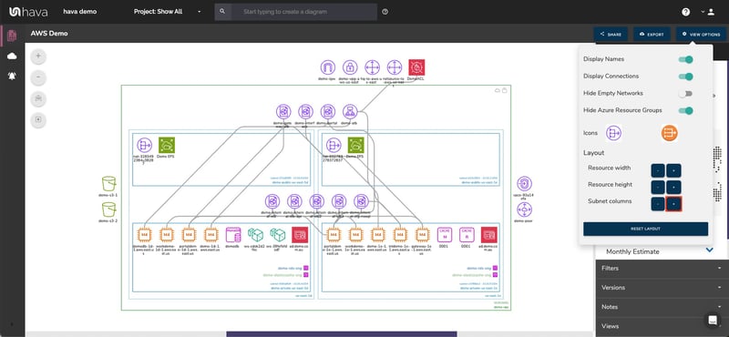
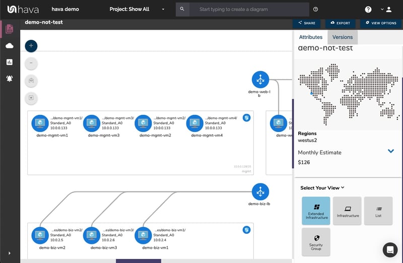
When you create network visualization diagrams with Hava, your network is laid out logically by virtual network or VPC. Within each diagram subnets are drawn within availability zones. What this layout provides is the ability to spot redundancy issues. If an AZ has an outage, will your application persist? The Hava layouts allow you to answer that question easily.
Using Hava.io, generating cloud network topology diagrams for AWS, GCP and Azure is extremely straightforward. By creating an AWS cross account role, set of Azure read only credentials or a GCP Service account and adding them to Hava, you'll have your first set of diagrams automatically created.
When you think of a network diagram, you generally imagine a static document containing resource icons, maybe some supporting text adjacent to the icons and a bounding box or two to represent VPCs or Subnets.
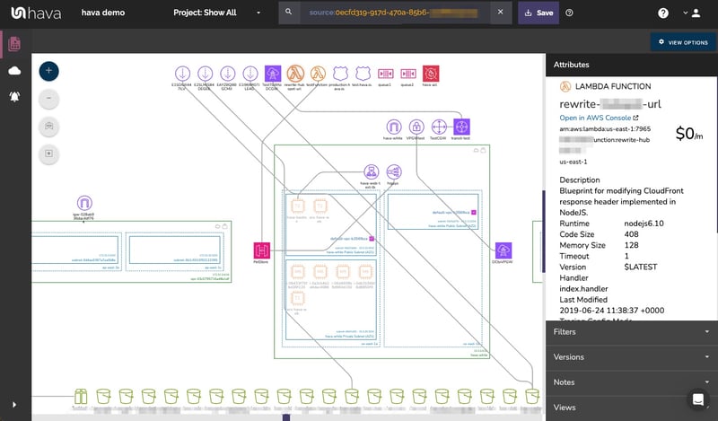
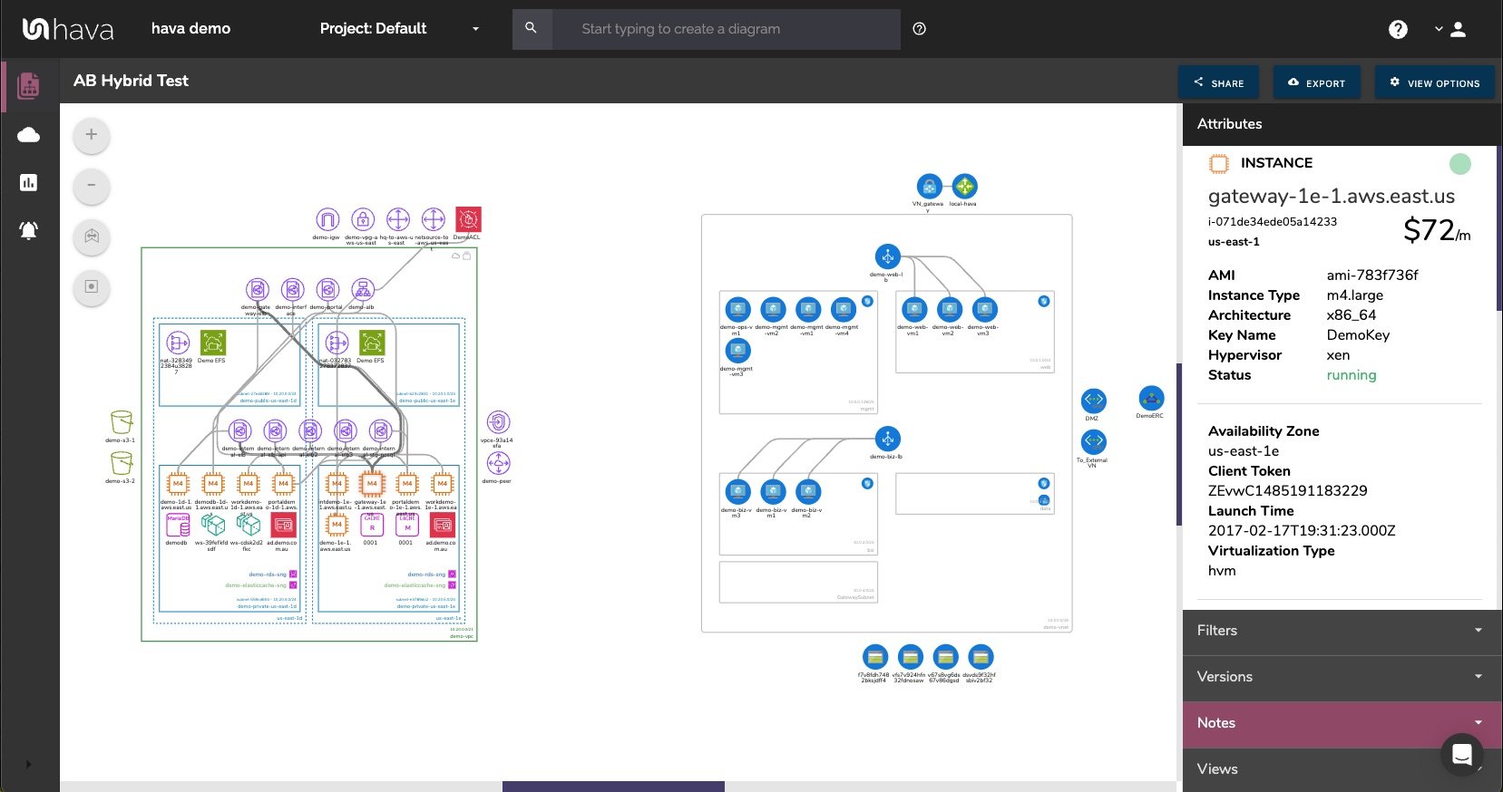
The term "Diagram" doesn't really do justice to the visualizations that Hava automatically generates. When your cloud config is scanned, the settings for each resource discovered are also captured. When you select a resource on the diagram, the contextual attribute pane to the right of the diagram displays all of the known config data. This saves you having to switch out to your cloud console to find more information about the resource.
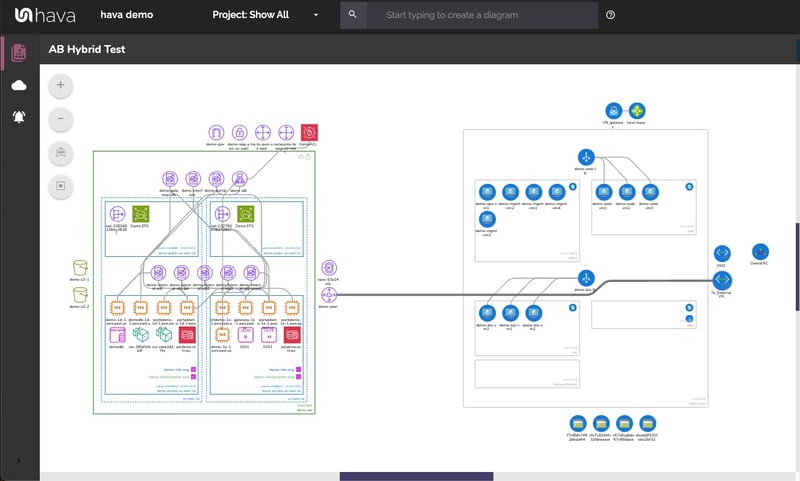
The AWS infrastructure view diagram is created when a VPC is discovered in an environment. Within the VPC, each availability zone is laid out in columns containing all the discovered subnets.
As previously mentioned, selecting a resource, subnet or the entire bounding box VPC will change the attribute pane to display details about the selected item.
In addition to the infrastructure view, AWS environments also spawn a security group diagram.
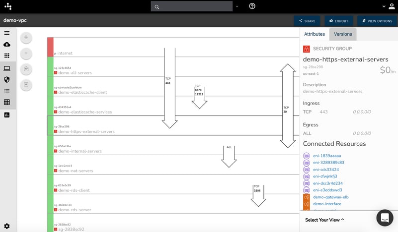
The security view displays all the discovered security groups. On top of the groups, the open ports a traffic flow is overlaid which allows you to view the traffic ingress and egress and hopefully spot any vulnerabilities caused by misconfigured ports.
AWS container workloads are also supported via diagram visualization.
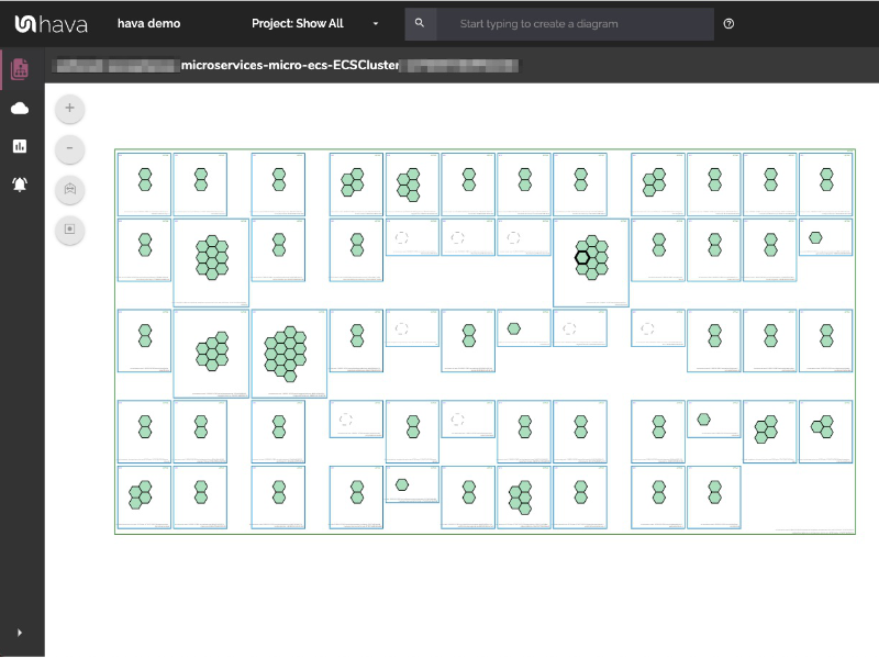
You can see all of the visualized resources for AWS here
Google cloud diagrams are supported by Hava. The GCP diagrams are laid out by Network. Sub Networks are mapped within the network and contain discovered resources. Zones are also visualized within the Virtual Networks.
Currently security and container views for GCP are on the development roadmap.
A list of visualized GCP resources can be found here
Azure is the third platform supported by Hava for which diagrams are automatically generated. Azure Network Diagrams are generated for each discovered resource group, which in turn contain virtual networks and subnets.
The interactive nature of the Azure diagrams means you can select resources and components just like the AWS and GCP diagrams to dig into the settings and configuration of each component.
A full list of visualized Azure resources can be found here
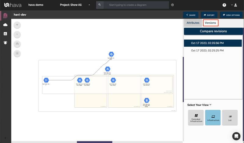
Hava continuously scans your AWS architecture and when changes are detected a new diagram set is automatically generated. The superseded diagrams are not discarded or overwritten. Instead they are moved into version history. Still fully interactive.
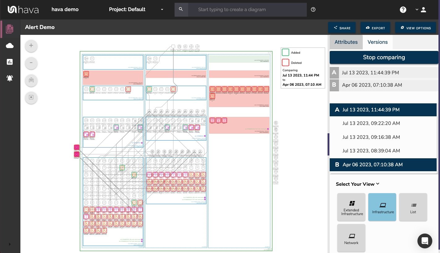
What this means is you can view your cloud architecture at any point in time and also leverage Hava's revision comparison (Diff Diagrams) to quickly identify what has been added or removed between the two diagram dates.
So you can easily identify all the changes made since your last compliance audit, or see what changed yesterday that is causing unexpected network or application errors.
While diff diagrams are super helpful in diagnosing changes after the fact, you may want to keep on top of changes as they happen.
Hava's architecture monitoring alerts will let you know the minute a change is detected. You simply nominate the environment you wish to monitor and add a group of recipients to receive the alerts. When a change is detected like the addition or removal of a resource, Hava will send each recipient a diff diagram showing the changes.
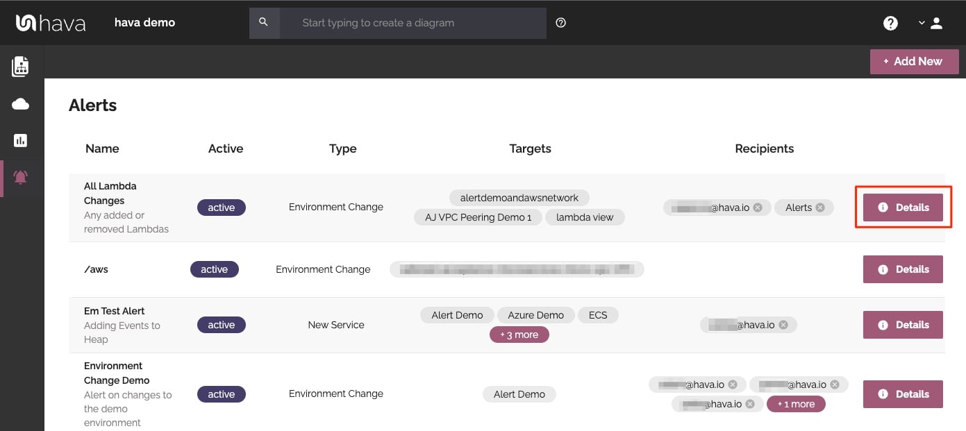
Now you and your security team can be across every change as it happens so you can assess and take action if required.
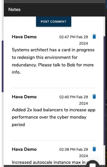
For every architecture diagram generated you have the ability to add text comments. This serves as a rolling dialogue your team can contribute to that may better explain elements of the diagram or bigger picture concepts related to the diagram.
Notes are accessed from the accordion menu within the attribute pane.
New notes are added to the top of the list so they are stored in chronological order.
Finally, your documentation is only useful if it is accurate. It is quite possible to spend weeks manually constructing network topology documentation only to have it rendered useless by a minor change to your network configuration.
In the middle of an outage or network incident that has taken down your application, being able to quickly establish what should be running is crucial.
Built into Hava is an auto-sync function that polls connected data sources and automatically updates diagram sets when changes are detected. This means your diagrams are always current and up to date. The superseded diagram sets aren't discarded however. They are placed into a version history that enables you to pull up older diagrams in the same fully interactive format.
This allows you to quickly and visually identify changes to your cloud network topology, so you can easily compare a previously working set of network resources with the current configuration to see what's missing .
It also allows you to demonstrate the status of your network at any point in history. This can be invaluable during a pci compliance audit or insurance claim should your network design ever be called into question.
Native AWS architecture diagrams created by Hava are the nearest we've seen to the examples and recommendations provided by AWS. These are great to view and interrogate via the interactive dashboard, however sometimes you'll need to pull a set of diagrams for audit purposes or for management or sales presentations.
Hava's built-in export function allows you to do this in a number of formats.
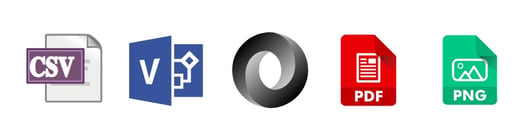
CSV, VSDX, JSON, PDF and PNG
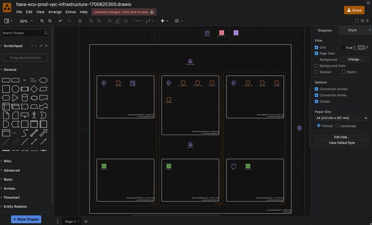
Should you want to manipulate or embellish your Hava generated diagrams, exporting to VSDX format and using Visio, draw.io or any VSDX compatible drawing package will allow you to edit your diagrams as required.
Should you not have access to Visio but would like to try this out, try opening one of your exported VSDX files in draw.io
Getting Hava to do the bulk of the heavy lifting by initially generating accurate diagrams based on what is actually configured and running in your AWS environment enables you to access a base diagram ready to edit which will save you hours or possibly days preparing management reports or upgrade plans.
If you are working with AWS, Azure or GCP and can see the benefits of improved accuracy and massive time savings by automating your documentation production, then moving to an automated solution like Hava will help improve accuracy, remove time sucking manual drawing tasks and may surface resources or security vulnerabilities you are presently unaware of.
You can try out Hava here:
P.S. it's free to try, no credit card required.
Cloud Computing Infrastructure Charts are an essential part of cloud computing from an Engineering, DevOps and Management perspective. Here's why...
Cloud computing jobs are always in demand. In this post we take a look at the different roles and responsibilities across the cloud computing...
A comprehensive glossary of cloud computing terms / terminology drawn from the AWS, Azure and GCP cloud computing platforms.