aws
The benefits of generated cloud documentation
There are numerous reasons why any organisation with cloud computing infrastructure should automatically generate documentation. Faster onboarding,...
When you are building applications or managing infrastructure on AWS, being able to visualise what you have built in diagram form has several major advantages,
Not only are you able to validate that what you intended to deploy is running, but you also have an invaluable tool to help you explain the network to internal management and stakeholders as well as bringing new engineers, developers and consultants up to speed quickly.
Good cloud architecture diagrams, especially ones that are auto generated from AWS console settings will detect all the resources in your AWS account and map them on to your diagrams which of course includes AWS Load Balancers.
When you connect your AWS accounts to Hava via a secure read-only cross account role, the software scans your console settings and auto generates a diagram set for each VPC detected.
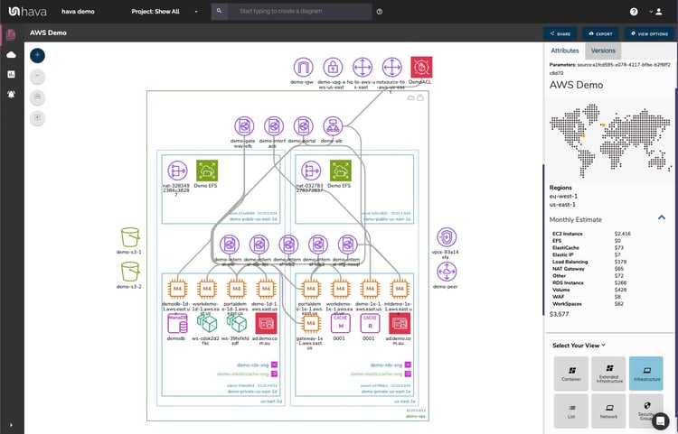
All the major resources are mapped out on the VPC diagram with the application load balancers represented by this icon:

And the elastic load balancers like this:

Selecting a load balancer will change the attribute pane to the right hand side of the diagram to show the settings and metadata related to it.
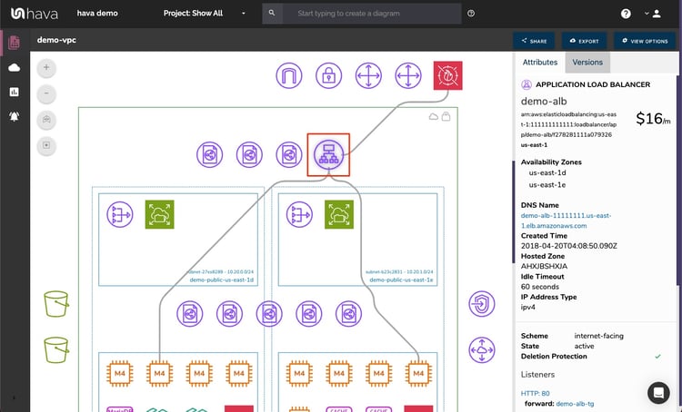
Selecting the load balancer also reveals the connections, in this case between the WAF and two EC2 instances.
The Attribute pane displays the known settings or metadata that pertains to the load balancer, namely:
The major advantage of Hava's approach to interactive diagrams is that all the above information isn't crammed onto the diagram or revealed in a pop up that obscures the diagram, so you always have a clean unobstructed view of the network topology.
Another massive time saver on top of not having to spend hours or days drawing the diagram from scratch, is that you can click around on the diagram to dig into other provisioned resources like the connected EC2 instances, without having to exit out to your AWS console to find the information.
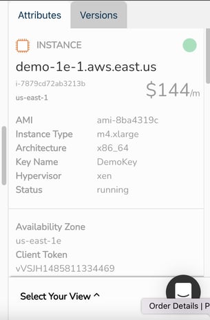
The EC2 instance details pulled back from the AWS console settings to the Hava attribute pane are comprehensive and include:
From there you can select the other resources on the diagram or drill down deeper in the information above, like selecting a security group and seeing all the detail relating to that, from right within the attribute pane, all the while the diagram remains uncluttered and unobstructed.
What can you do with your AWS Load Balancer Diagram?
As already highlighted, your AWS infrastructure diagram is a visual confirmation that everything you intended to provision is running, however the fun doesn't stop there.
The first thing you can do with your diagram is to embed it into any web property that supports an iFrame. This could be an internal wiki or support desk, or a job ticketing system like Jira.
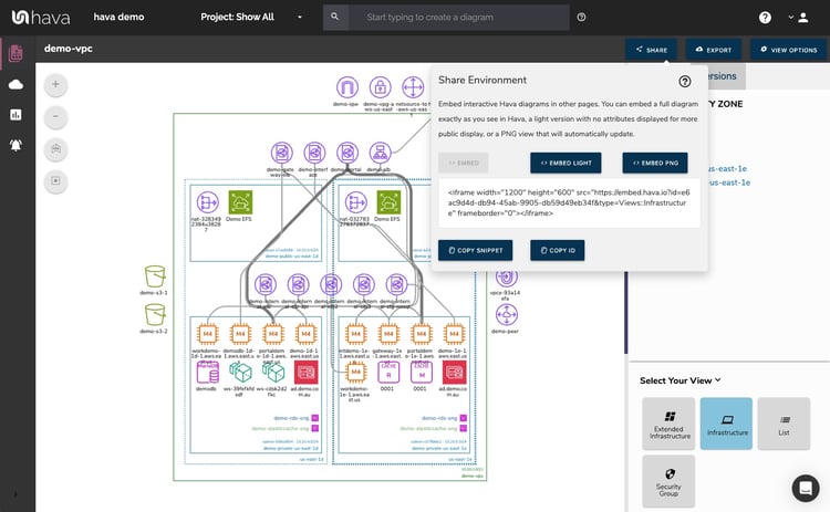
Your team members could then view and interact with your AWS load balance diagram without needing a Hava account. Obviously use this with caution.
You can also export your Hava diagrams in a number of formats like pdf or jpg for a static diagram that you can insert into presentations or reports or JSON should you wish to programmatically interrogate the data. There is also a VSDX Visio format export:
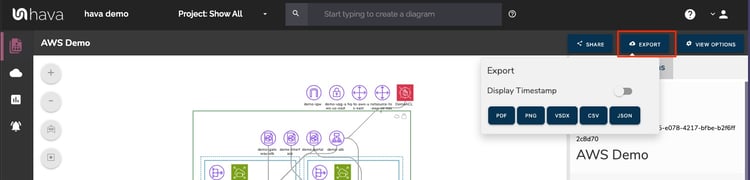
This can be passed to Visio or a compatible drawing package like diagrams.net so you can edit the diagram which is useful if you are using your existing network as a baseline for some redesign work.
Hava natively does not support editing because the diagrams are continuously updated based on actual provisioned resources.
When a change is detected a whole new diagram set is generated, so you always have the current network state documented. This provides an accurate audit ready diagram generated from the source of truth. Because superseded diagrams are not deleted or overwritten, but placed in version history, you always have an audit trail to help determine what changed should you suddenly experience unexpected network or application behaviour.
So whether you building, developing or supporting AWS virtual networks (with or without load balancers) Hava makes it simple to automatically generate your AWS network diagrams and keep them perpetually up to date, all hands free, no drag and drop required.
You can take Hava for a 14 day free trial, learn more here:
There are numerous reasons why any organisation with cloud computing infrastructure should automatically generate documentation. Faster onboarding,...
There are numerous reasons why any organisation with cloud computing infrastructure should automatically generate documentation. Faster onboarding,...
There are numerous reasons why any organisation with cloud computing infrastructure should automatically generate documentation. Faster onboarding,...