aws
AWS Infrastructure Diagram using Hava
AWS Infrastructure Diagram Software automatically generates your AWS Infrastructure Diagrams, hands-free, no drag-and-drop required. Diagrams stay up...
When you are building cloud based applications and networks on AWS, there are many compelling reasons why you would want to accurately diagram and document your AWS infrastructure. Knowing exactly what is running based on the actual resources configured in your AWS environments is probably the number one reason to use an automated AWS infrastructure diagram generator over manually drawing diagrams yourself using a drag and drop process.
The automation process discovers exactly what architecture is running in your AWS accounts, so you can provide the drawings and documentation to onboard engineers faster, get to grips with new client networks quickly or report to management in an easily understood visual format.
Sitting down with a copy of Visio, your AWS Icon template pack and an open AWS management console is a daunting prospect, especially if your AWS environment contains more than a handful of VPC's, EC2 instances or a load balancer or two.

Not only do you need to manually draw out your VPC's, subnets and resources which can take hours or even days, once you have drawn your diagrams, you then need to keep them up to date if they are going to be of any practical use. That's where using automated AWS diagram software comes into play.
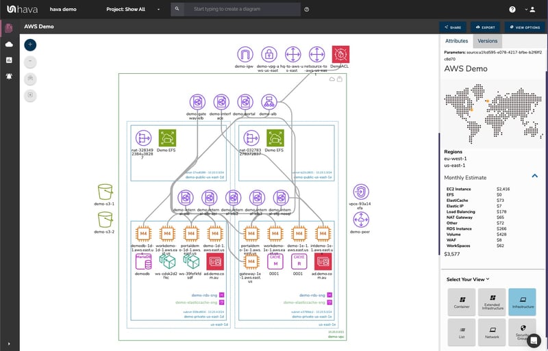
There are a number of network topology diagrams that can prove useful to your engineering and DevOps team. These include an AWS Infrastructure diagram like this:
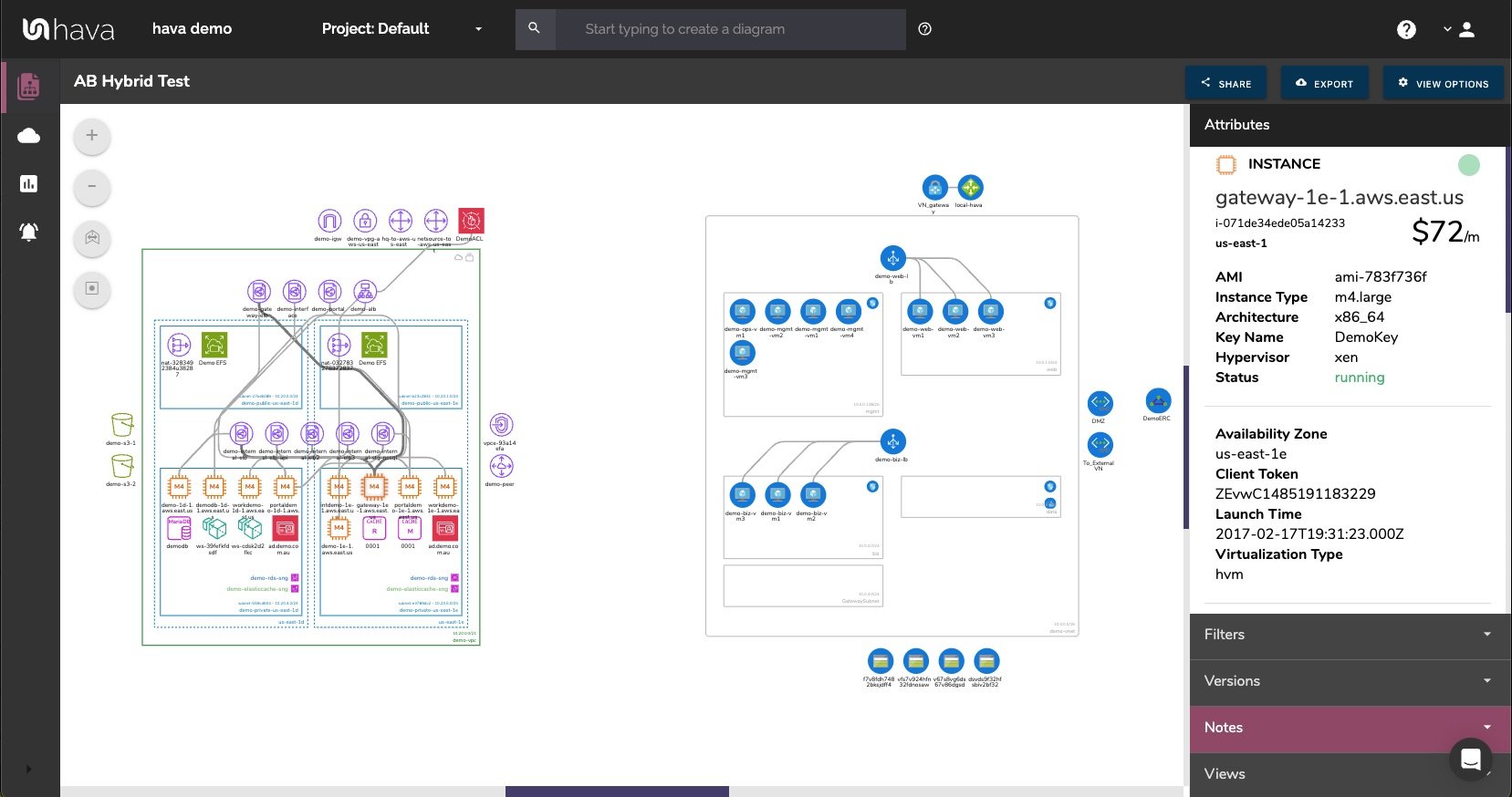
The above diagram logically lays out all the resources discovered when an AWS account is connected to Hava's AWS Infrastructure Diagram Generator. The main VPC (the green rectangle) is surrounded by associated resources like internet and VPN gateways, S3 Buckets, VPC endpoints, VPC peering connections, Elastic Beanstalk instances and so on.
Within the VPC, the configured availability zones are set out in columns that contain the individual subnets set up in those availability zones. All the resources contained in each subnet are visualized as are any load balancers routing traffic to the various resources.
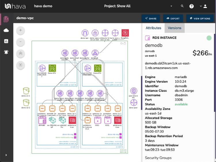
Having this diagram automatically created from configuration data enables interrogation of each of the resources to see the settings and associations related to it. By default the Hava diagrams are kept clean, only visualising resource icons and optionally names and connections. By clicking on any of the individual resource icons, the attribute pane on the right then displays all the known details pertaining to the resource. You click on an EC2 instance for example and all the known metadata relating to the instance is immediately available, something that simply isn't possible with manually created drag-and-drop diagram makers.
Automating the diagram build using an AWS Infrastructure Diagram Generator also reveals resources you may not be aware of. Long forgotten database instances and sometimes entire dev or test environments are regularly surfaced by this automation process.
Hava continuously scans your AWS architecture and when changes are detected a new diagram set is automatically generated. The superseded diagrams are not discarded or overwritten. Instead they are moved into version history. Still fully interactive.
What this means is you can view your cloud architecture at any point in time and also leverage Hava's revision comparison (Diff Diagrams) to quickly identify what has been added or removed between the two diagram dates.
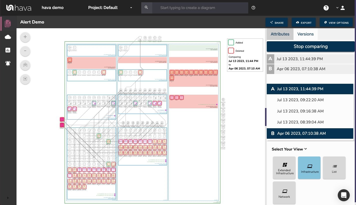
So you can easily identify all the changes made since your last compliance audit, or see what changed yesterday that is causing unexpected network or application errors.
While diff diagrams are super helpful in diagnosing changes after the fact, you may want to keep on top of changes as they happen.
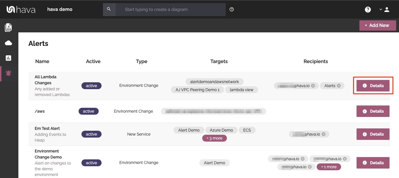
Hava's architecture monitoring alerts will let you know the minute a change is detected. You simply nominate the environment you wish to monitor and add a group of recipients to receive the alerts. When a change is detected like the addition or removal of a resource, Hava will send each recipient a diff diagram showing the changes.
Now you and your security team can be across every change as it happens so you can assess and take action if required.
There is always somewhat of a compromise when it comes to auto generated documentation. The way that Hava discovers and builds diagrams is based at a VPC level. If more than one VPC is detected in your Amazon cloud account, then one diagram per VPC is created.
You may however want to combine two or more VPCs onto a single diagram. This can be achieved using the custom query function built into hava.io.
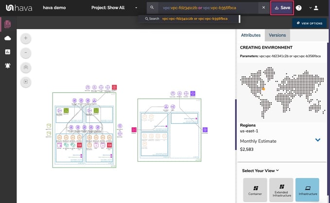
This custom query would create a new 'on-the-fly' custom diagram containing the two nominated AWS VPCs specified in the query. You would then have the ability to save this diagram so it is always present in your dashboard until you choose to delete it. As with all other diagrams, your custom AWS infrastructure diagram would keep itself up to date and retain a version history every time a resource change is detected.
The custom query can also be used to locate resources fast. If you are an MSP for instance with thousands of AWS accounts under management, you could issue a single search which can query hundreds or thousands of connected accounts for the resource, tag or IP address you are searching for.
A Database admin could create a single diagram with all the databases from across hundreds of accounts, be they AWS, Azure or GCP databases.
From a usability perspective it is just not practical to include every single component onto a VPC diagram. Take for instance network interfaces, volumes or WAF rules. In a large network with hundreds or maybe thousands of these second tier components, trying to visualize every single component would make the diagram practically unreadable, or certainly too busy to easily recognise the core components.
Hava solves this by providing detailed components list that details every single resource detected, whether they are visualised on the main diagram or not.
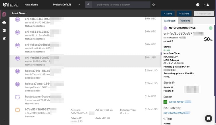
This comprehensive list of resources can also be sorted and exported along with estimated monthly costs so you can see at a glance what resources are costing you the most money. This detailed view is also interactive. Selecting a resource on the diagram will reveal all the known settings and associations that resource has in the attribute pane.
Another major benefit of automating the discovery of your AWS environment diagrams is the ability to capture and visualize security group information.
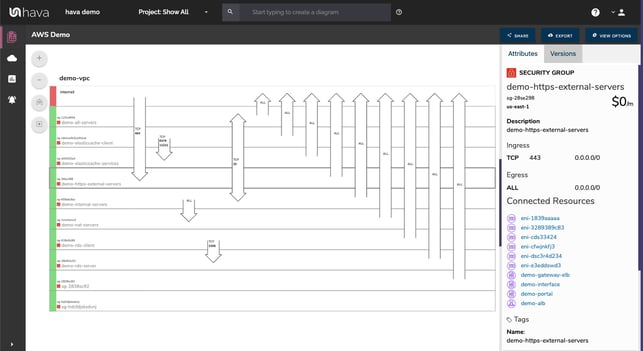
With a security group diagram you can view all of your configured security groups with the open ports overlaid to enable an instant visual snapshot of the traffic flow ingress and egress points. The diagram also being interactive ensures you can select a particular security group on the diagram and important information relating to the group, like the connected resources, IP addresses and associated tags.
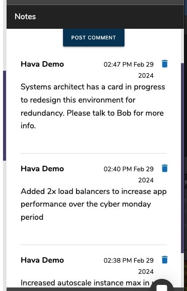
For every architecture diagram generated you have the ability to add text comments. This serves as a rolling dialogue your team can contribute to that may better explain elements of the diagram or bigger picture concepts related to the diagram.
Notes are accessed from the accordion menu within the attribute pane.
New notes are added to the top of the list so they are stored in chronological order.
Once you have created your infrastructure diagrams you are able to place them into external web properties using the Hava share and embedded viewer.
A fully detailed interactive diagram can be shared using an embed iframe code snippet. This diagram is almost identical to being logged into Hava, except no log in credentials are required.
A cut down version called "Embed Light" is also available to embed. This version removes any sensitive details from the diagram, like IP addresses so may suit more public facing web properties.
There is also a static PNG that can be inserted that is not interactive.
All three diagrams are dynamic endpoints that update when your Hava diagrams update. This means if you have placed a diagram into a Notion document, a github markdown document or used the Hava confluence plug in to embed a diagram into your Wiki, the diagrams will reflect the current network configuration without any action on your part.
Finally, your documentation is only useful if it is accurate. It is quite possible to spend weeks manually constructing network topology documentation only to have it rendered useless by a minor change to your network configuration.
Built into Hava is an auto-sync function that polls connected data sources and automatically updates diagram sets when changes are detected. This means your diagrams are always current and up to date. The superseded diagram sets aren't discarded however. They are placed into a version history that enables you to pull up older diagrams in the same fully interactive format.
This allows you to quickly and visually identify changes to your cloud network topology.
It also allows you to demonstrate the status of your network at any point in history. This can be invaluable during a pci compliance audit or insurance claim should your network design ever be called into question.
Native AWS architecture diagrams created by Hava are the nearest we've seen to the examples and recommendations provided by AWS. These are great to view and interrogate via the dashboard, however sometimes you'll need to pull a set of diagrams for audit purposes or for management or sales presentations.
The built-in export function allows you to do this by providing these export options
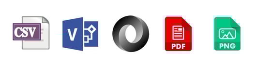
CSV, VSDX, JSON, PDF and PNG
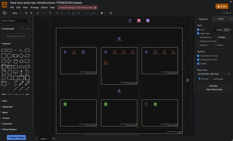
Should you want to manipulate or embellish your auto generated AWS diagrams, exporting to VSDX format and using Visio, draw.io or any VSDX compatible drawing package will allow you to edit your diagrams as required.
Hava does not provide the ability to edit diagrams or allow you to add or remove resources. This is so the diagrams generated by Hava remain true to the actual configuration of your network which means they will stand up to scrutiny during an audit.
Should you not have access to Visio but would like to try this out, try opening one of your exported VSDX files in draw.io
Getting Hava to do the bulk of the heavy lifting by initially generating accurate diagrams based on what is actually configured and running in your AWS environment enables you to access a base diagram ready to edit which will save you hours or possibly days preparing management reports.
There aren't too many people that would dispute the benefits of perpetually accurate AWS network documentation. Hava provides just this with:
You can find out more about Hava here:
AWS Infrastructure Diagram Software automatically generates your AWS Infrastructure Diagrams, hands-free, no drag-and-drop required. Diagrams stay up...
Hava's AWS Architecture Diagram tool automatically generates your AWS Infrastructure Diagrams, hands-free, no drag-and-drop required. Diagrams stay...
Hava's AWS Architecture Diagramming tool automatically generates your AWS Infrastructure Diagrams, hands-free, no drag-and-drop required.