aws
AWS Cloud Architecture Diagram Generator
The Hava AWS architecture diagram generator is the easiest way to auto generate interactive AWS Network Architecture diagrams that auto update and...
When you work with AWS cloud architecture, you almost certainly understand the importance of documenting your AWS VPCs and container clusters using network architecture diagrams.
Should you experience an unexpected change in network or application behaviour, like a drop in speed or application errors due to unavailable resources, you need to find out what happened fast. Having up to date AWS diagram architecture always on hand coupled with the availability of historical versions of your network topology greatly assists in diagnosing exactly what has changed so you can quickly resolve the problem.
Accurate diagrams are probably the fastest way to quickly identify what your network should look like in the middle of an outage. Trying to establish changes using log files across multiple services and applications can be a time consuming process. If a resource is inadvertently deleted or an AWS outage takes essential resources offline, comparing live and historical snapshots of your network will quickly surface what is missing visually.
Not only do accurate automatically generated AWS network architecture diagrams visually represent the construction of your AWS network, they can greatly assist in speeding up the on-boarding of new team members and external consultants.
If you have been working with AWS for any length of time, you probably already understand the value a good AWS diagram architecture provides. The reason so many engineers or developers don't maintain accurate network diagrams is the time it takes to manually construct VPC diagrams. Swapping back and forth between your manual diagram software to your console settings is a tedious task that takes up precious time that could be put to better use. For a developer or ops engineer, there's always something more important to do.
If you have a complex network or multiple applications and environments, it can take days or even weeks to research and map out your VPCs. When you have done all the hard work mapping out your AWS resources onto your AWS diagram architecture, you then need to spend even more time keeping the diagrams up to date.
When you take on existing AWS infrastructure as part of project, or need to deploy infrastructure for a new application or maybe while on-boarding a new client network, the first thing you need to establish is what does the existing AWS infrastructure look like. What resource instances do you have running, what VPCs exist, what availability zones are they in, what does the security group surface look like.
When you know exactly what is already deployed, you can then commence any design work required to make the network faster, more available and more secure, or work out how to integrate a new project or application feature into the existing infrastructure without breaking anything that is already deployed.
If you are a product manager or network architect, a clear, well laid out auto generated AWS network architecture diagram of your production environments allows you to see at a glance what actually exists and whether your design has been implemented as expected.
With your AWS diagram architecture laid out in front of you, you can spot the vulnerabilities and can realistically know what to expect if say an AWS availability zone or entire region goes offline.
If the thought of logging in to your AWS account console(s) to start to manually mapping out your network with a drag & drop diagramming tool fills you with horror, you're not alone. It's something nobody we know gets excited about, which is probably why accurate AWS network architecture diagrams are rarely prioritised and seldom available during an unexpected outage.
Then of course, no sooner have you completed drawing your aws diagram architecture than something changes and you have to update all the diagrams to reflect the changes. With the numerous modern CI/CD approaches like deploying infrastructure as code, or getting AWS to autoscale resources in response to spikes in usage, this manual process can take days or even weeks for larger environments.
Back in the day when the core of our engineering team were cloud consulting, we knew that the information we needed for diagrams was available in the AWS config data so we built Hava to reduce the diagramming process from days or weeks of laborious manual drawing down to a few seconds. What was once a tedious task nobody enjoyed was condensed into a simple process of generating a set of cross-account role credentials, connecting to Hava and letting the Hava application do the rest.
Initially getting the AWS VPC infrastructure mapped was our primary focus which was achieved with the Hava Infrastructure View.
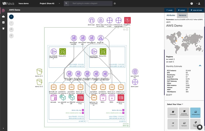
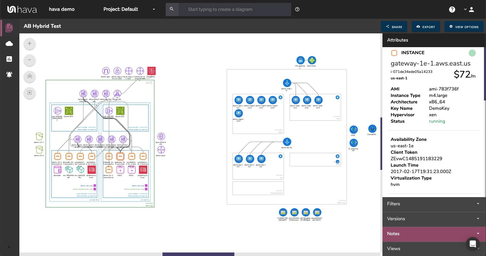
The Hava VPC Infrastructure view lays out your AWS VPCs detected by Hava into separate diagram sets. Subnets within the VPC are mapped within the columns of AWS availability zones. The AWS VPC diagram generated also displays both internal and external resources.
The diagrams automatically generated by Hava are interactive, which means clicking on any of the resource icons on the infrastructure diagram changes the attribute panel to the right of the diagram which allows you to take a deep dive into the resource settings like security groups, IP ingress/egress ports, connected storage and so on. The VPC diagrams also display the estimated costs of each resource which are totalled for the entire environment when the environment is opened up.
You can also toggle on and off the ability to view connections and resource names. With these additional displays off, the diagram is extremely clean and readable especially as the attribute pane to the right displays all the metadata related to any selected diagram component.
Right from the beginning, we decided to keep the Hava diagrams clean and free from non essential resources like network interfaces that could flood the diagrams with unimportant information making them messy and confusing so you end up with a clean and easy to read diagram.
Although these less important components are not on the infrastructure diagrams, you do need to know about these 'non-visualized' components, so we created the "List View". The List View is an extensive data set that lists all the resources discovered in your AWS configuration. This view lists both visualized and non-vizualized resources.
The listed resources also have an estimated cost detailed against them.
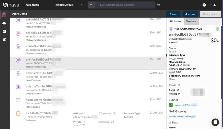
One of the major benefits of this list view is the ability to sort the list, including by descending costs. This reveals what resources make up the bulk of your estimated cloud spend which should help when you are looking to save cloud costs or explain to management which important resources make up the bulk of your AWS bill.
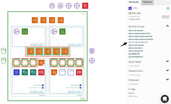
The security view was next diagram we added to Hava. Since we already had the configuration metadata and relationships coming back from AWS, our client's security teams asked if we could diagram the security relationships the same way we were able to visualize infrastructure. This led to the AWS Security View.
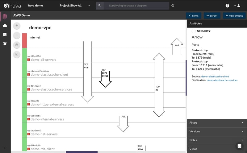
The Hava security view shows you all of your AWS security groups and overlays the open ports to show how traffic passes through your network. You can select a security group on the diagram to see all the connected resources in the attribute pane, as well as the ingress and egress port numbers and associated IP addresses related to that resource.
This high level view of your security groups can make some security config issues obvious, like ports used for development or testing that have been left open, or direct access from the internet to network segments that should be public.
The Hava AWS security diagram is truly unique and is a result of a team of experienced engineers knowing exactly what information is important to security teams monitoring traffic across a cloud based network.
One of the benefits of having a team of grizzled cloud engineers behind a product like Hava as opposed to say a drag and drop flow chart drawing package, is that we are always close to the market and hundreds of front line cloud engineers. If we don't pick up new technologies and methodologies first, then our customers will, and are sure to send in feature requests which we endeavour to integrate into Hava as soon as possible.
This is evidenced by the rising popularity of AWS Container Services. As more development teams embrace containers to deploy applications and provide portability of software between environments we added the Hava Container View.
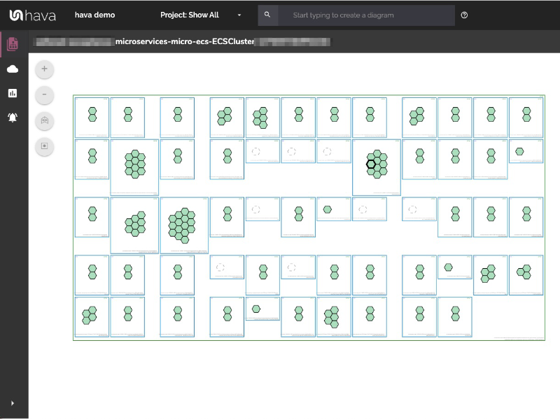
The container view displays your ECS Services and the contained ECS tasks inside an ECS Cluster.
Hava also supports EKS kubernetes clusters managed on AWS as well as stand alone Kubernetes clusters.
Hava continuously scans your AWS architecture and when changes are detected a new diagram set is automatically generated. The superseded diagrams are not discarded or overwritten. Instead they are moved into version history. Still fully interactive.
What this means is you can view your cloud architecture at any point in time and also leverage Hava's revision comparison (Diff Diagrams) to quickly identify what has been added or removed between the two diagram dates.
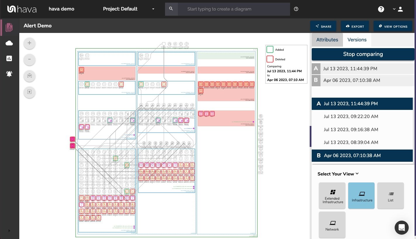
So you can easily identify all the changes made since your last compliance audit, or see what changed yesterday that is causing unexpected network or application errors.
While diff diagrams are super helpful in diagnosing changes after the fact, you may want to keep on top of changes as they happen.
Hava's architecture monitoring alerts will let you know the minute a change is detected. You simply nominate the environment you wish to monitor and add a group of recipients to receive the alerts. When a change is detected like the addition or removal of a resource, Hava will send each recipient a diff diagram showing the changes.
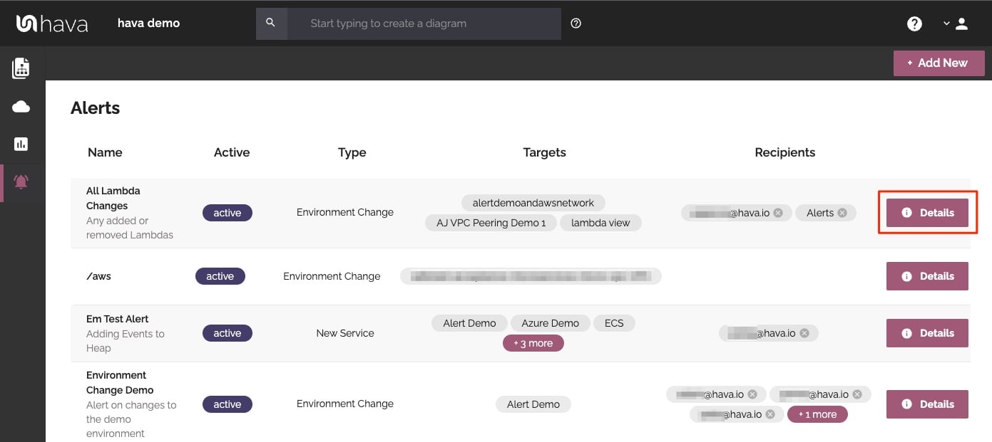
Now you and your security team can be across every change as it happens so you can assess and take action if required.
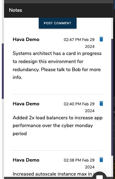
For every architecture diagram generated you have the ability to add text comments. This serves as a rolling dialogue your team can contribute to that may better explain elements of the diagram or bigger picture concepts related to the diagram.
Notes are accessed from the accordion menu within the attribute pane.
New notes are added to the top of the list so they are stored in chronological order.
Whichever diagram or view makes the most sense or delivers the information your team needs to build and manage your environments, the upside to using a hands free automatic AWS Cloud Diagram Tool like hava.io is that your diagrams are sourced directly from your AWS configuration, so nothing is missed out and nothing can be added by mistake.
What you see is from the source of truth, always accurate and always up to date.
When your configuration changes, so do the diagrams, all automatically, all hands-free, no human interaction required. The diagrams that are automatically replaced are archived in a version history. You can open up the historical diagrams at any time you like. They are fully interactive so you can compare old configurations to new ones to find out what changed in the event of a problem or compliance audit.
The diagrams generated by Hava are also exportable. You can produce an AWS architecture PDF or a JPG for inclusion in your reporting as well as CSV and JSON.
There are currently two options for using Hava to generate your cloud infrastructure diagrams.
Option 1: Hava SaaS
The SaaS option is by far the quickest and easiest way to start visualizing your AWS cloud infrastructure.
You simply create an AWS cross account role with read only permissions, then log into hava.io and connect your AWS account. Hava will read your AWS config data and render the diagrams and start to track any changes for audit purposes.
A 14 day fully functional trial is available (along with demo data) so you can try Hava for yourself. At the time of writing, no credit card is required to take the trial.
Option 2: Self Hosted
The self hosted option allows you to run Hava from within your own AWS infrastructure. If you have particular security or enterprise policies that prevent the connection of 3rd party applications to your cloud environments, then self-hosted may be the solution.
Both options are identical in functionality, but you will need to contact our support team to organise a self-hosted solution.
As well as using the application console to generate and view diagrams, Hava has a fully featured API that allows you to programmatically add and remove data sources, projects and diagrams.
We recommend requesting a one on one demo with our sales team if you would like to see Hava in action and explore the self-hosted option.
You can contact us via sales@hava.io or jump into a free trial, learn more here:
The Hava AWS architecture diagram generator is the easiest way to auto generate interactive AWS Network Architecture diagrams that auto update and...
The Hava AWS Diagram VPC tool is the easiest way to create interactive AWS Network Architecture diagrams that auto update and capture changes in a...
AWS Architecture diagrams for compliance are essential. When auditors want to see proof of your cloud architecture and security, heres how Hava can...