aws
AWS VPC Diagrams by Hava
You can stop wasting your valuable time manually drawing your AWS VPC Diagrams using this fully automated diagram maker. Find out how...

In the often hectic DevOps world there would be few people that do not appreciate the necessity for well crafted and accurate cloud network topology diagrams.
The benefits of visualising your AWS infrastructure are many and varied. Whether it's instant appreciation of exactly what is running, faster on boarding of new team members or faster comprehension of the security implications of your network design, an accurate diagram delivers the information you need in a format that is easy to understand and saves you hours or days deciphering the same information presented in console or spreadsheet format.
In our humble opinion, any AWS diagram Software documentation solution should be:
We spend a great deal of our time striving for efficient automation. Whether it's your CI/CD pipeline, code deployment or backup regime, automation is usually the end game.
Network documentation is no different. Which would you rather? Sit down with a drawing package, open your cloud console(s) and spend hours or days constructing what you believe to be the current state of your infrastructure? Or would you rather connect your cloud account(s) to an application that takes care of everything to produce accurate network documentation.
The automated route ensures everything is discovered. This includes resources that you may potentially be unaware of, like legacy test or dev environments that nobody knows about, or obsolete database instances that were preserved 'just in case'.
Automation also ensures you are not adding resources to your aws architecture diagrams that no longer exist which can be a common problem given the elastic nature of some cloud environments.
Once your AWS infrastructure diagram is complete, the work has only just begun. Diagrams are next to useless if they are not up to date, yet the thought of committing hours updating documentation every time a resource changes in your network fills most engineers with dread. Which may be the reason accurate documentation is so often never tackled in the first place.
Whatever solution you choose to generate your network topology diagrams, you should ensure that the solution has the ability to monitor and update the diagrams when infrastructure changes are detected.
That way you ensure everyone in your IT ecosystem can tell at a glance what the current state of play is with your AWS infrastructure. Whether it's offshore developers, new hires or multiple project teams, you can all be 100% confident in the structure and nature of your AWS environments when you can pull up diagrams safe in the knowledge that what you are looking at is the truth, especially if it was updated in the past hour or two.
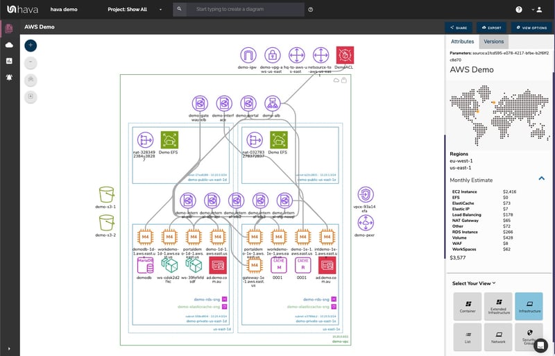
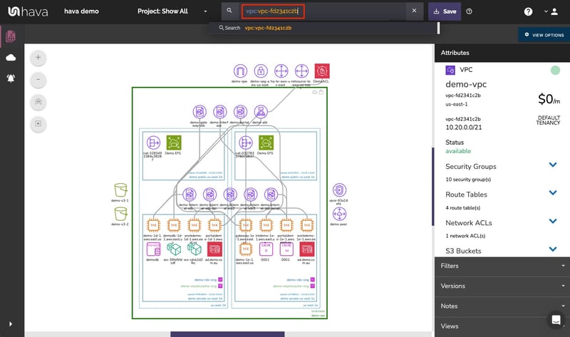
Static diagrams can be enhanced greatly by allowing the resources to be selected so that detailed attributes related to the resource can be displayed. This approach allows you to view an uncluttered diagram, but still be able to drill into individual components, VPC's, Subnets or security groups to get at the information you might need.
Having your diagram interactive also enables some other cool features like hovering over a security group name and having the diagram highlight all the resources governed by that group, or selecting a resource to reveal what it is connected to.
Having the ability to select a Route Table name or Network ACL to reveal the associated resources can quickly give the viewer visual appreciation of how your network is configured.
All these connections and associations are valuable when selected interactively in isolation but would make the diagram almost unreadable if they were all visualised at the same time.
When environments change having your documentation and diagramming solution automatically update diagrams is super helpful, it saves you hours or days keeping documentation up to date.
However, if diagrams are simply over-written then you can run the risk of losing important information necessary to diagnose application errors or unexpected spikes/reductions in infrastructure costs.
In an extreme example imagine someone deletes a production database. Your application stops working so you pull up your network topology diagram and there's no RDS instance to be seen. How do you know it was ever there?
By saving the superseded diagram in a version history, you can pull up the old diagram and compare it to the current version. This is of even greater value if the archived diagram is also fully interactive so you can compare attributes and settings at a granular level.
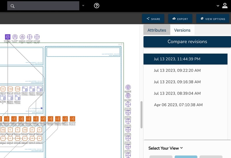
Having a version history is also a good governance strategy from a compliance standpoint. If your network or security is called into question during a PCI Compliance audit or insurance/legal investigation, having historical documentation that's also fully interactive enables you to demonstrate exactly how your cloud infrastructure was configured at the point in time being examined.
One of the challenges when producing effective network diagrams is deciding what to include on the drawing itself.
Say you have an EC2 Instance on your diagram.
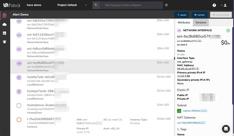
This instance has a stack of useful information like the instance type, AMI, type of architecture, key name, hypervisor, current status, what AZ is it running in, client token, virtualisation type, private DNS name, private IP, launch subnet, security groups and network interfaces and volumes. That's before you even get to the unlimited number of tags you use internally to group your resources and projects.
Having all this information written down against the EC2 instance on the diagram creates a huge unruly mess, especially if you have dozens or hundreds of resources to consider.
The solution is to only display this contextual information when it's needed by making the diagram interactive. Select the resource and the attributes for the resource are displayed.
The same can be said for security groups, route tables, network ACLs and so many other settings and config details that are invaluable, but would render the infrastructure diagram almost unreadable if they were all included
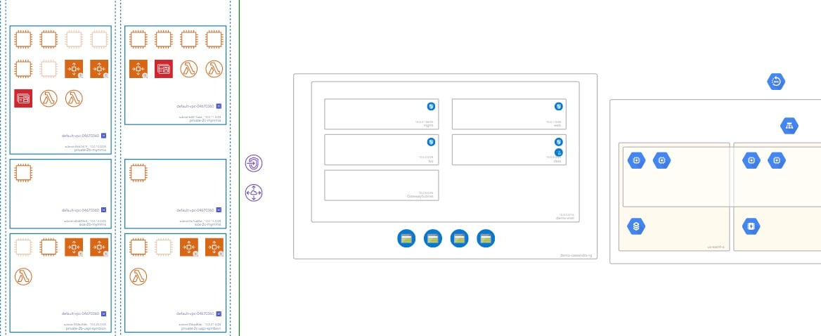
A visualised representation of your AWS network allows you to easily grasp the design and structure of your infrastructure. Effective visualisations should detail the important resources on your diagrams and leave off the less important.
A simple diagram like this, could have as many as 50 network interfaces and 40+ volumes.
Could you imagine another 90-150 icons representing Network Interfaces, Volumes, WAF rules, elastic IP or DHCP options on the above diagram? The important information would be lost in the mess. In our DevOps consulting history, we found it far better to store these 2nd tier resources in a comprehensive list so they are still accessible but we could concentrate on the more significant components.
In the same way that it's not all that useful to visualise second tier resources on your diagrams, it can also be problematic to include too many relationships or settings on top of your network topology diagram.
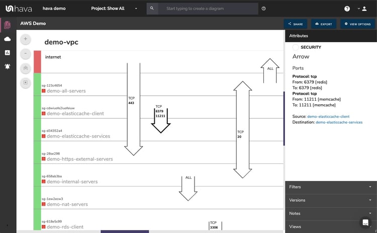
Take for instance security groups and open ports. Overlaying or trying to detail what security groups an individual instance belongs to can soon lead to another confusing diagram especially when a single resource can be governed by multiple security group policies.
Splitting out the security groups and visualising them as well as overlaying the open ports on a separate diagram solves the problem. Having the same interactive nature, a separate security view diagram allows you to select an AWS Security Group to reveal the ingress/egress data and all the connected resources.
Open ports can then be visualised over the top of the security groups showing exactly where traffic enters and exits your network.
One of the downsides of automated diagram solutions is the sometimes rigid nature of the import and the lack of flexibility in the resulting diagrams.
While automatically generating well laid out and 100% accurate diagrams of your cloud infrastructure is a fantastic resource and time saver, sometimes you don't need the complete environment included in your documentation.
You might be a managed service provider that sets up all your client accounts under one AWS account using individual subnets. In this instance, the ability to nominate just the required subnet and produce diagrams that start tracking changes into version history and self update is required.
Or it may be that you are only interested in documenting anything tagged as 'development' or 'production'.
Whatever the case, your automated cloud infrastructure diagram solution should have the ability to spin up custom diagrams that detail just the information you require.
If you have the ability to create custom diagrams using tag names or any of the above, and then have the resulting diagram keep itself updated with a full interactive version history, all the better.
Companies are increasingly utilising the best features across multiple cloud IaaS vendors. It's now not uncommon to build solutions using AWS that utilise resources in either Google Cloud Platform, Microsoft Azure or both.
You may also have multiple AWS accounts that you need to visualise on the same diagram.
Your cloud infrastructure documentation and automated diagram solution should ideally have the ability to incorporate multiple accounts from multiple cloud vendors on the same diagram. Then once established, these hybrid diagrams should also auto sync with your cloud accounts , detect configuration changes, automatically update the diagrams and store version history as changes are detected.
Finally whatever solution you choose to stay on top of your cloud infrastructure diagram automation, it should have a solid API that allows you to incorporate documentation into your build pipeline.
As well as meeting all the requirements discussed in this post, Hava has an active and responsive development team with a strong support ethic that puts customers first while also progressing our extensive product roadmap.
You can currently take Hava for a free 14 day trial without the need for a credit card. Learn more here:

You can stop wasting your valuable time manually drawing your AWS VPC Diagrams using this fully automated diagram maker. Find out how...
Hava's AWS Network Diagram Generator will automatically generate network diagrams from AWS, hands-free, no drag-and-drop required. Diagrams stay up...
The Hava AWS Deployment Diagram Tool is the easiest way to create interactive AWS network topology diagrams that auto update and capture changes in a...