cloud
Azure Architecture Diagram | Hava.io
Microsoft Azure architecture diagrams are essential when building or managing Azure Cloud infrastructure. Here's how to Automate the creation and...
When you are building or operating applications built on Microsoft Azure, one of your primary concerns will be keeping track of any changes that impact the performance of your applications.
Whether that's changes you are making manually or changes that are being made by the platform, you should be monitoring changes to make sure the user experience is always improving and not being negatively affected by network topology changes.
There's no question that anyone involved in cloud computing solutions from network architects, application developers through to DevOps engineers appreciate the value of a well laid out network topology diagram.
Being able to present your network visually helps improve your ability to communicate how it is constructed at all levels of your organisation. You can easily answer questions like:
All these questions and many many more can be answered easily with a network topology diagram.
When unexpected issues occur you need to find out fast what went wrong. Did your team release new infrastructure code that broke the network. Did another team on another project break yours. Has something that was there yesterday suddenly disappeared or has something new appeared. Without a base diagram to compare changes to, responding effectively to adverse events can be difficult.
Having a current up to date infrastructure diagram, or list of resources that you can compare to a snapshot of your previous configurations gives you the perfect place to start troubleshooting and resolving the issue .
If you have automated systems in place to capture config changes and store the previous pre-state change diagrams, you'll always have the luxury of visual comparisons at your disposal.
It's probably fair to say that the lag between intended network reconfiguration and updating of diagrams and documentation is almost always greater than anyone intended. That's assuming of course the documentation ever gets updated.
Automation is the only reliable course of action.
When you have solid accurate diagrams representing how your Azure network looks today vs how it looked yesterday bringing new engineers or consultants up to speed quickly becomes a lot easier especially if there are budgetary pressures at play.
Having visualized environments is just quicker, smarter, more efficient and gets new team members up to speed at a fraction of the cost of doing it manually.
Which also applies to external consultants. If you bring in external cloud consultants to work on infrastructure redesign or security, there's a really obvious tangible cost associated with them getting up to speed with your project. Anything that can reduce the time that takes could potentially save your business money and allow them to move the project along faster.
Network performance issues and price changes are typical triggers prompting the need to know what changes have been to your Azure infrastructure. Cloud Diagrams are useless if they are not accurate.
Even if manual documentation is created with precision, it will soon become out of date especially in today's dynamic environment where templated Infrastructure and code is being continuously deployed or events are triggering automated scaling.
On top of increasingly dynamic cloud networks, It's extremely easy to miss resources you are not aware of, or include ones that have recently been modified or deleted especially with multiple teams working on different projects in the same cloud accounts.
Auto generating infrastructure diagrams removes the capacity for manual errors. What's on the diagram at any point in time is what is running. This gives your team certainty. It allows your architects to review the application build and ensure what was designed, is what is running. It also gives your devops and engineers the capacity to quickly review implementation strategies to ensure everything went according to plan.
When you visualize your cloud environments for the first time there is a good chance there will be resources or instances you weren't expecting.
Resource outliers that aren't connected to anything. Unused test environments. Duplicated resources, or open ports used in the development stage that should have been locked down, but weren't.
These outliers can be difficult to spot in management consoles, but are immediately obvious when visualized on an automated infrastructure diagram. If you don't know something exists, it's a safe to say that you won't go looking for it.
Automated diagrams will reveal all.
Hava is an automated diagram solution that will allow you to track changes in Azure.
Azure is one of many cloud platforms that are compatible with hava.io which will safely connect to your cloud console configuration via read only credentials to automate the production and updating of azure infrastructure diagrams like the one above.
Connecting Hava to your Microsoft Azure account so that your network topology diagrams can be automatically generated is a relatively simple process.
To import your environment resources from Microsoft Azure, you will need to access your Azure Portal at https://portal.azure.com You then create a new Service Principle and retrieve a set of credentials to connect to Hava.
Once connected Hava will periodically sync with your Azure configuration and detect any discovered changes. When changes are detected a new diagram is created and the superseded diagram is placed into a fully interactive version history, so you always have an accurate visual representation of your Azure Environment whenever required. This is how to track changes in Azure.
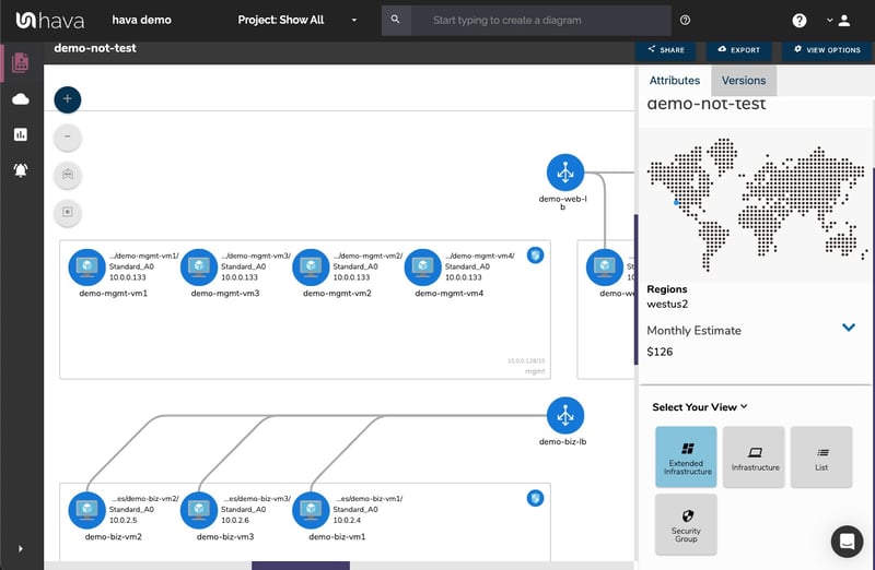
The Microsoft Azure diagrams produced are laid out by resource group which typically contain subnets running in virtual networks. All of the resource metadata isn't placed on the diagram, but is displayed in a contextual attribute pane to the right hand side of the diagram.
Connections and resource names can be toggled on or off depending on your preference. The resource names appear under the diagram icons when enabled.
This keeps your Azure environment diagram clean, however this allows you to select the interactive elements of the diagram, like a virtual network, subnet or individual resources like load balancers, gateways, virtual machines, peering connections and storage accounts. When you select a resource on the diagram, all the metadata and settings are displayed to the right hand side of the diagram in the attribute pane. The metadata and settings are contextual to the currently selected element.
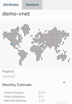
With nothing selected on the diagram, the attribute pane displays information about the entire Azure environment including a usage cost estimate.
Versioning is one of the most powerful aspects of using Hava as part of your build pipeline or cloud engineering toolkit. Hava keeps track of the changes detected in your Microsoft Azure infrastructure via continuous automated polling of your Azure configuration.
Once a change is detected, Hava creates a new diagram and the superseded diagram is placed in the version history. At any time, you can select older versions of your network diagram to view which remain fully interactive, not just a static diagram. You can click into resources, inspect attributes and settings and view in extended infrastructure and 3D just as you can on the live diagrams.

If you are trying to diagnose a network problem or a change that has caused your applications to fail, selecting an older diagram set, you can pull up the older version in a separate browser and compare current diagrams side-by-side so you can easily visually detect the differences.
You can also export the CSV or JSON data from the current and older version to programmatically compare the diagrams to surface the resource or setting changes.
So that's how you can automatically capture changes that are made to your Azure environments, so not only do you have hands free up to date diagrams whenever you need them, but you also have an audit trail of network changes that you can use to track changes in Azure.
There are also a number of other side benefits of using Hava to track and diagram your Azure environments.
There is currently no way within Hava to draw diagrams from scratch or to add or remove diagram elements. This is because native Hava diagrams are designed to always reflect the source of truth. You can always be confident that what you are looking at on the Hava diagram accurately reflects the reality of your Azure environment. This is because there is no way to add or remove diagram elements, resources and metadata that could lead to confusion or mis-represent the state of the network during a security or compliance audit for instance.
We do however appreciate that sometimes you would like to use your Hava Azure network diagram as a starting point for some redesign work, or maybe you would like to annotate a diagram to explain elements of the diagram in management or sales presentations.
To facilitate that scenario, Hava provides:
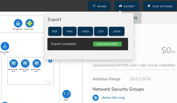
The VSDX export option is the solution that enables you to export your Microsoft Azure infrastructure diagrams in Visio format. You can then use Visio or a compatible application like draw.io (diagrams.net) to import the diagram for manipulation.
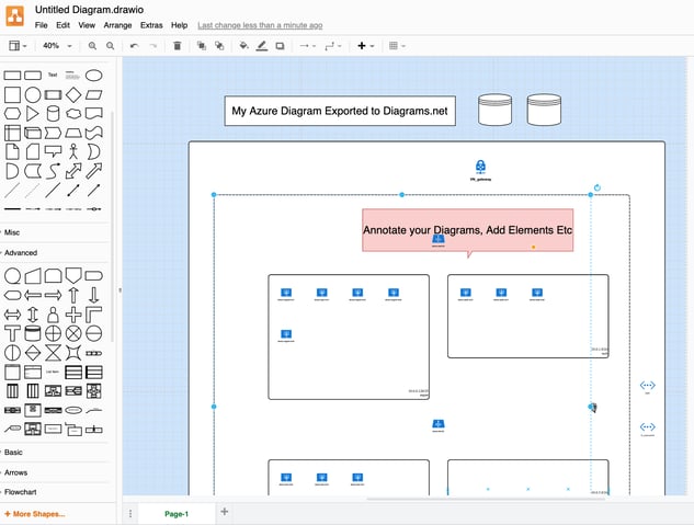
This provides you with exported editable diagrams while also maintaining the integrity of the diagrams and data held within the Hava ecosystem, so you have an unquestionable source of truth reference retained within your Hava account for use during a PCI compliance, Insurance, security or other type of audit.
On top of the standard infrastructure and 3D diagrams, there are two more Azure diagrams that are automatically produced by simply connecting your Azure account to Hava.
The extended infrastructure view is the same as the infrastructure view, however it adds some more information to the diagram like full resource names, IP addresses and resource sizes.
The final Microsoft Azure diagram is the "List View" . This diagram is more like a report and as the name suggests, is a list of all the resources discovered in your Azure environment.
This includes elements discovered in your data source configuration that are not visualised on the diagrams. Some resources may have dozens of unimportant instances like network interfaces or virtual machine extensions, which add very little to the understanding of how the network is constructed and which if visualised could make the diagrams difficult to read.
The list view is where you can find these resources. The list can be filtered, sorted by name, type or price and exported to CSV for easy import into a spreadsheet that can be used for cost analysis. The list view also includes the resources that are visualized on the infrastructure view.
So there we have it, possibly the easiest way to track and document changes in your Azure environments is to introduce Hava to your cloud engineering toolkit.
You can take Hava for a 14 day trial here:
Microsoft Azure architecture diagrams are essential when building or managing Azure Cloud infrastructure. Here's how to Automate the creation and...
Microsoft Azure architecture diagrams are essential when building or managing Azure Cloud infrastructure. Here's how to Automate the creation and...
Microsoft Azure diagrams are an essential tool when building or managing Azure Cloud infrastructure. Here's how to Automate the process.