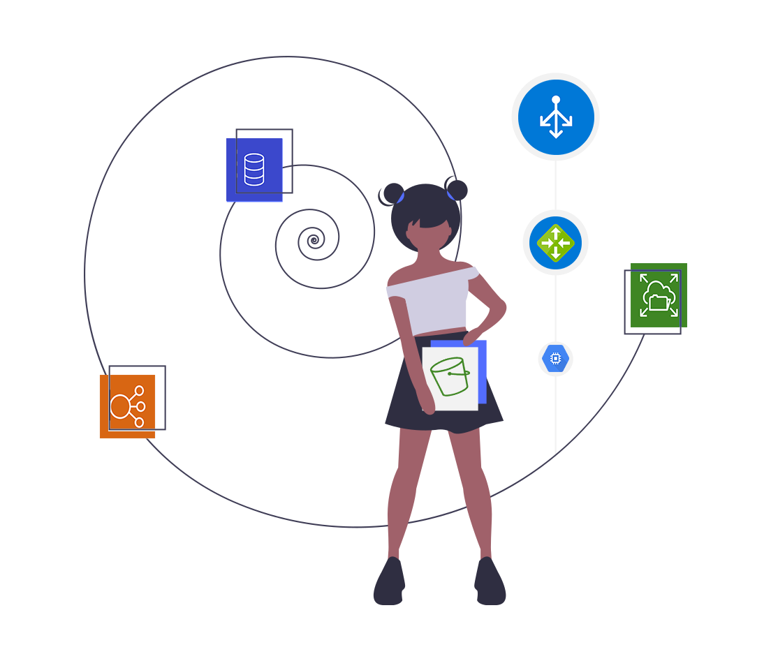
Cloud Computing System Architecture Diagram
There are numerous reasons why any organisation with cloud computing infrastructure should automatically generate documentation. Faster onboarding,...
In these fast paced agile times where developer independence is encouraged, the opportunities to adopt the services offered by cloud providers that allow developers to save time and money are numerous.
While this can be viewed as a good thing, it also provides challenges for those tasked with maintaining and paying for these services.
As IT architecture moves towards more external services, more micro services, more containers and more cores across multiple cloud providers, you can be sure it will become harder to keep track of and maintain network infrastructure.
This is especially true as developers leverage the strengths of competing cloud platforms resulting in hybrid multi-vendor solutions.
IT services sprawl is quickly becoming a large issue affecting teams of all sizes and the only effective way to combat this without slowing down development and operations is with enhanced visibility.
System visibility is most prevalent in the form of monitoring applications such as New Relic, App Dynamics, OpsView et al, which leads teams to forget or ignore the less flashy option, documentation.
Most people groan at the thought of producing and maintaining documentation and with good reason. In these days of fast paced CI/CD and the dynamic and elastic nature of cloud configurations with disposable resources, it's not unusual for configurations to change multiple times a day, meaning that documentation is often out of date as you are creating it. If your documentation is inaccurate with missing resources or showing resources that no longer exist, then it may as well not exist at all.
Throughout the course of a project, architecture is bound to change, so producing a static diagram at any point in a project will reflect the state of play on that day and not necessarily what actually exists today.
The 7000 strong, leading global software consultancy Thoughtworks highlighted the need for generated network diagrams in their highly respected "Technology Radar" publication as far back as May 2015. System generated documentation jumped straight into the "Adopt" recommendation section of the report, bypassing the usual assess and trial stages.
"When we need a diagram that describes the current infrastructure or physical architecture we usually take to our favorite technical diagramming tool. If you are using the cloud or virtualization technologies this no longer makes sense, we can use the provided APIs to interrogate the actual infrastructure and generate a live, automated infrastructure diagram"
~ Thoughtworks Technology Radar 2015
The ability to leverage API calls to build infrastructure diagrams is the first step in creating an effective documentation strategy. The next step is automation, or to be more precise constant automation. Having systems that continually poll your cloud infrastructure to detect changes that then trigger documentation and diagram updates is ultimately the end goal.
If you have to manually invoke data imports to update diagrams, then you may as well go back to manually drawing them because at the end of the day, you are just too busy or have better things to do than to keep your infrastructure diagrams up to date. That's assuming you know exactly what all of the teams with access to your infrastructure are pushing into production in any given day.
By far, the ultimate solution is to have an automated system that keeps your documentation up to date. Which sounds great, but what if you miss changes. What if a config change happens that causes production issues, but is reversed before you see it. You're left to respond to an outage or mission critical support issues that can't be replicated.
The solution is to have your automation capture version history as your documentation is automatically updated. That way you have a robust audit trail of changes made to your IT infrastructure that will provide the data to not only solve or explain production issues, but also meet the requirements of the most stringent PCI or insurance audit.
Having your "always up-to-date" documentation on hand is great. Being able to utilise API calls to replicate the current infrastructure diagrams and use them in your build pipeline is the final piece of the professional documentation puzzle. Deploying infrastructure as code with built in visualization is the ultimate solution for those that follow to easily understand what was being deployed.
See this example: https://medium.com/weareservian/how-to-gif-your-infrastructure-pipeline-with-hava-for-lifecycle-visibility-3c2a85752289
Hava was created to solve all of these challenges. A tool to help you automatically generate diagrams of your AWS, Microsoft Azure and Google Cloud GCP environments.
Just generate a set of read only credentials or an AWS cross account role, plug them into your Hava cloud accounts and with one click you'll start automatically generating logically laid out interactive network topology diagrams that keep themselves up to date.
Need to see cross-account, cross-region or cross-provider hybrid diagrams? All you need to do is utilise Hava's powerful deep-search to construct and save a custom diagram once and it will be automatically generated and updated until you delete it.
Diagrams like the ones produced by Hava allow you to generate GCP, Azure and AWS Diagrams that are always up to date to instantly diagnose network issues and explain visually how and why a network is designed the way it is.
It allows you to identify weak points in your architecture. Having a helicopter view of the VPC's, regions or virtual networks configured in your infrastructure, you can immediately see what will happen if your cloud provider has a regional outage. You can spot redundancy weaknesses.
Because your network topology is automatically generated, you also see EXACTLY what is running, where it's running and what it's costing your organisation.
Do you have old test environments running that are no longer needed. Are there old databases or storage buckets that were preserved "just in case". Are there massively over-specced resources that can't really justified when you measure traffic expectations versus reality.
All the things will become apparent once you connect your cloud accounts to hava.io
Hava takes care of your documentation so you can concentrate on development and not paperwork. Your team can be fully across your infrastructure making it easier to explain the state of play to management and new team members which makes on-boarding developers and ops engineers so much easier.
The unique AWS Security diagrams produced by Hava will also give your security team an instant visual reference of the potential ingress/egress of traffic into and out of your network. All the security groups, open ports and traffic flow are visualized which provides an understanding in seconds that which would normally take hours or days of combing through console setting to establish. This is a major advantage over just having a standard aws diagram.
On top of automated diagrams and an incredibly flexible API, all Hava diagrams are fully interactive, which means you can click on resources to see detailed attributes, hover over security groups to see what resources belong to the group, turn on connections to see how resources are connected. This is true for both current and diagrams in the version history.
It's never been easier to create cloud documentation that is accurate and always up to date using Hava's AWS, Azure and Google Cloud diagram generator.
You can try out Hava for free by taking advantage of our 14 day trial. No credit card required.
Just click the button below to learn more.
(No Credit Card Required )
There are numerous reasons why any organisation with cloud computing infrastructure should automatically generate documentation. Faster onboarding,...
There are numerous reasons why any organisation with cloud computing infrastructure should automatically generate documentation. Faster onboarding,...
Automatically generating perpetually up to date GCP network topology diagrams is a massive benefit to your team in terms of time saved and readily...